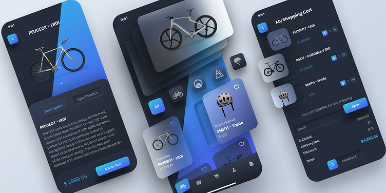
Bike App Concept
Hello everyone 👋🏼 !
Proud to share my latest exploration of the Bike App Concept. The aim of this case study is to highlight the impact of incorporating a unique dark mode user interface (UI) with angled shapes, glass layers, and neuromorphic buttons in a bike shopping app on user experience (UX). The app is designed for a bike store that allows users to browse and purchase various types of bikes, bike accessories, and services. The unique UI design was implemented to enhance the visual appeal of the app while also improving user interaction and navigation. Hope you like it and feel free to leave your feedback. Cheers! ✨
Press 💖 if you like our design and share feedback!
Please leave your comment.
===============================================
Available for work inquiry.
Email: walwaalemayehu@gmail.com

