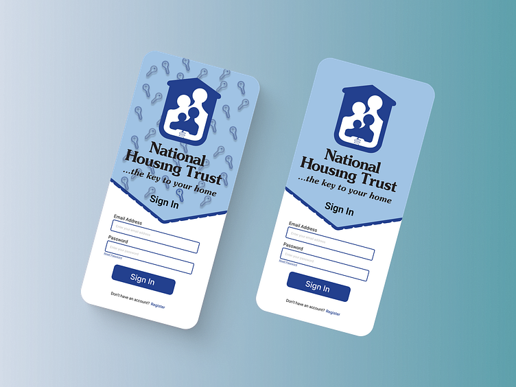
NHT Online App Redesign - Log In Screen
This is my concept of a redesign for the NHT Online App log in screen. The redesigned is aimed to keep the design simple while giving the application a modern feel.
I created two versions of my concept; one keeping it clean and simple while the other adds a little more character. Let me know what you think and you can let me know which one you like better.
Case study: https://www.behance.net/gallery/170172129/NHT-Online-UI-Case-Study
More by Shadae Trotman View profile
Like
