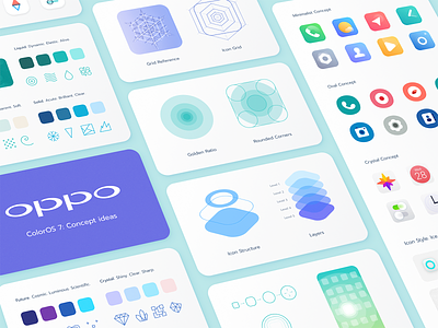
Oppo ColorOS Icons & Design System
💎 Read full case study
In cooperation with Oppo, we designed and animated ColorOS 7 icons. We created two sets called "pebbles" and "free form." This work presents the process of interaction and transformation of one set into another. The company logo also turns into an icon reflected in the animation.
One of the main tasks was to develop legible icons so that any user could easily understand their meaning, regardless of territorial features, and use them at their discretion.
Need help with your project? 📧 Contact us
More by Ramotion View profile
Services by Ramotion
Like
