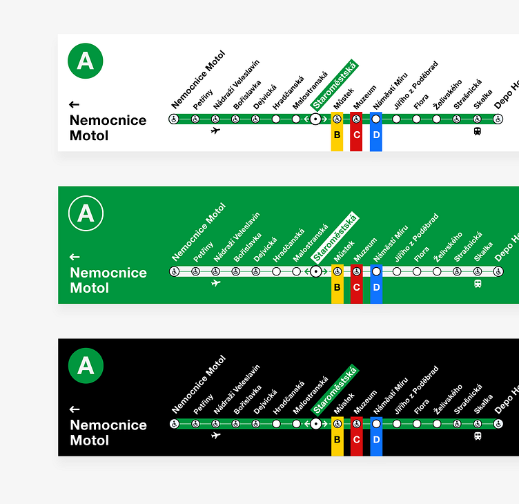
Prague Subway Navigation - Comparison
Here's a comparison of Prague Subway navigation concepts with various colors.
I think the green bg one could be problematic in terms of contrast - blue vs. green. So I'd prefer the light one.
For easy tranfers, color dots can be on sides, so it can be quick to identify, which direction to go, if you wanna get on different tube line.
There can be a subtle vertical line, which can help the passenger understand, which station he's at right now.
More by Antonin Kus View profile
Like


