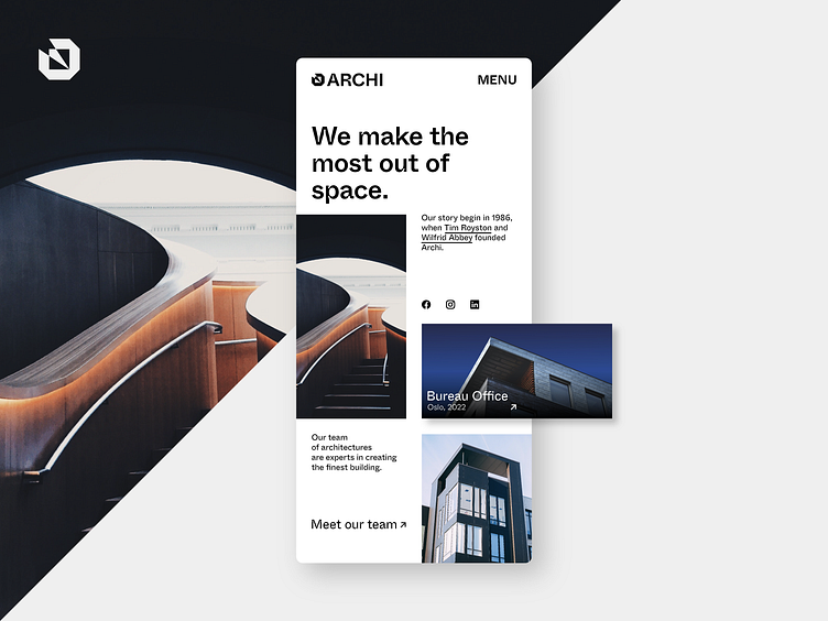
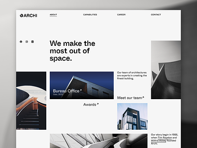
Archi mobile layout
Sometimes, trying to accommodate multiple devices with your design is like playing a game of Jenga: stacking and hoping it doesn’t topple over.
Luckily, in the case of Archi, a two-column compact grid system allowed us to maintain the design’s integrity without compromising on content.
Have you ever tried a similar approach, or do you have your own strategy for tackling the challenge of responsive design?
Cheers,
The Cognitive Creators Team
-------
Are you interested in working together?
Drop us a few lines at hello@cognitivecreators.com
Not sure yet? Visit our website to learn more!
Don’t miss out on our updates: LinkedIn | Facebook | Instagram | Youtube | Behance
More by Cognitive Creators View profile
Like

