#DailyUI Day 18: Analytics Chart.
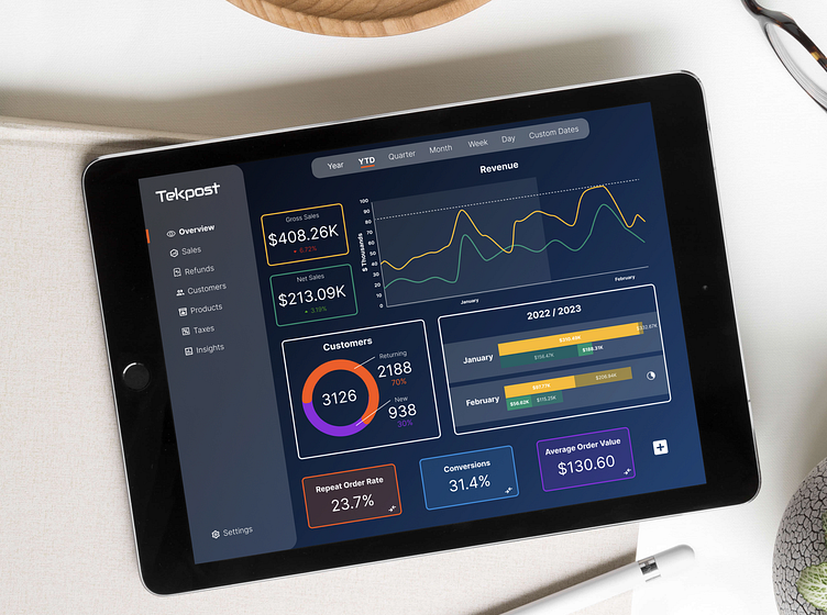
Today's prompt was a bit outside my comfort zone. I do have some experience with data visualization from my sociology background, I find it really difficult to make up data/charts for a hypothetical product. For this, I wanted to play around with color: I wanted to use a blue background and needed to bring in quite a few other colors for the data visualization purposes, but I didn't want it to feel overwhelming.
