Daily UI Challenge 007- Settings
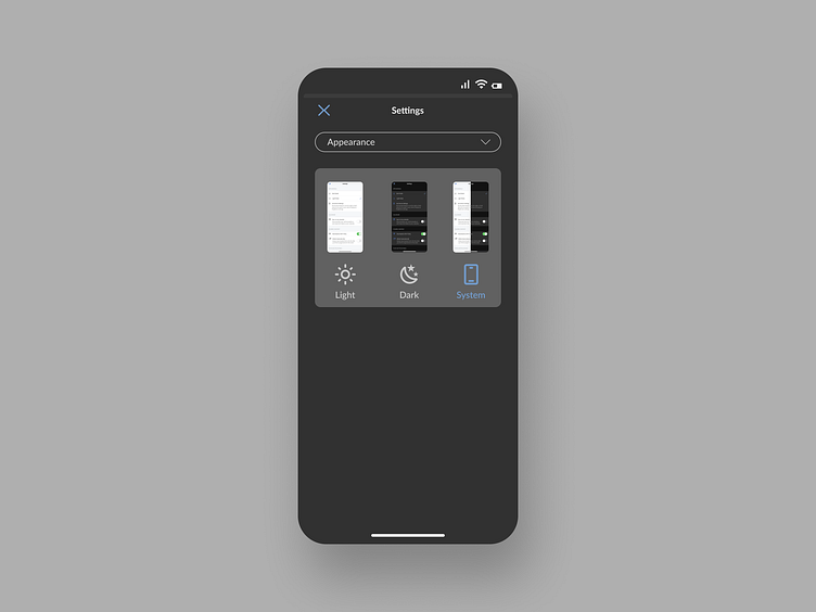
For this Daily UI challenge, I was tasked with designing a system's settings. I once again decided to work with mobile for this challenge, choosing to redesign the Coursera App's settings page.
Coursera's settings page heavily relies on text. All setting options appear on one scrollable page. In my redesign, I decided that the sections can be navigated to separately by using a dropdown menu. I chose 'Appearance' to be the section I would focus on. Instead of the use of just text and icons, I used images to indicate what the appearance would appear like when selected. The icons are used as radios for selecting, as seen above. In this case, the chosen system appearance is highlighted to indicate that is the currently selected mode.
More by Ruairí Horgan View profile
Like
