Monetize Your Services with usluge.ba | UI/UX design case study

Hey reader, I hope you’re giving your best today as it’s expected of you. When I started working as a graphic designer, I discovered a very cool design path, UI/UX design. I did solid research, Googled everything, and checked almost every YouTube video just to get more familiar with it. So, today, I am ready to show off my first UI/UX case study. Enjoy reading!
Research
While researching the app category itself, I came across several examples of worldwide apps that have a similar niche. In this case, the needs of the users of the app were almost the same as the needs of users on the Fiverr app. Therefore, the application should be extremely simple, easily accessible, and beautiful. In order for users to have the best possible experience through the application, the UX should be at a high standard. I didn’t base too much on my assumptions but asked family and friends what kind of app they would like. Finishing it, I got three main words, simplicity, efficiency, and beauty.
Problem
The main problem of today’s younger society in my country is the lack of business opportunities. Most young people focus on doing what they love and are satisfied with it, and they would also like to earn money. Therefore, why not create a platform where they can provide their services, the ones they are best at, and make money? This would solve a big problem for society.
The Solution
Solving this problem would be exactly like this application. A nice UI interface and quality user experience should build this application. The design itself would be simple so that it would be easy to use for all generations. In the application, we have used muted green color tones to indicate “peace and wealth”.
User Persona
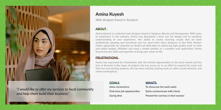
Amina Kuyesh is a local web designer who focuses on building websites for local clients and helping them build their businesses digitally. Amina promotes her work locally through several applications such as Instagram, Facebook, and TikTok, but this application would save her time in finding clients. That is, clients would be looking for her and not her clients.
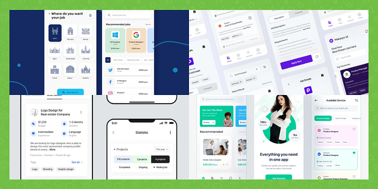
Inspiration
During the design process, I was constantly looking for inspiration for individual screens and other components.
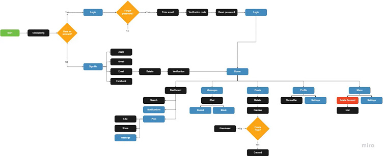
User flow
Here you can see the user flow of this application. Rectangles colored gray represent interactions, shapes colored orange represent decisions and blue represents pages.
Wireframes
Based on my sketch and wireframe, I decided to roughly present the design. I presented my current creativity through a sketch and wireframe in order to have a layout plan for later.
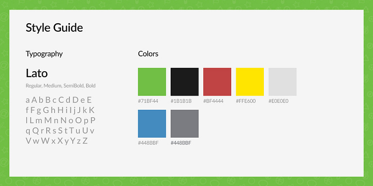
Style Guide
Design — Onboarding
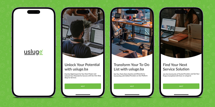
When you enter the application, you will see 3 onboarding screens that tell more about the application itself and instruct the new user on how to use it and what are its advantages.
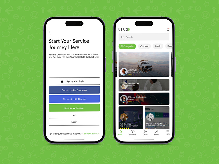
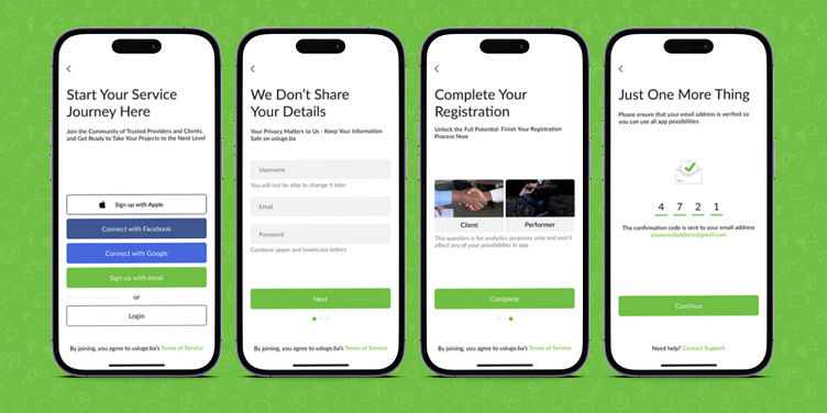
Sign up
When you finish the onboarding process, the sign-up screen will be shown up to you. At this moment, you can choose what method of sign-up you want to use, or even if you have an account, you can log in. Choosing the “Sign-Up with email” method will redirect you to the details screen and verify at the end.
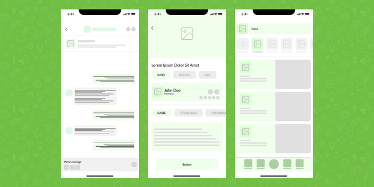
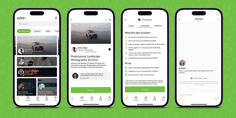
Dashboard and Post
The first screen (left to right) shows the home page or dashboard. This page should show the first advertised and most rated services so people can book a meeting with the best performers (a user who sells services). By clicking on the service post your screen will be switched to the second one on the image above. Here, you can easily see the performer’s testimonials and reviews, and also the big click-to-action element “Message”. Also, you can see their pricing plans or even a description of what they do.
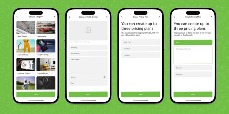
Creating Post
The “Create Post” page allows you to post your service online. You will be asked for a category so it’s sorted in the right category, and other details such as headings, prices, and others. It’s designed in four screens and a final preview screen before publishing.
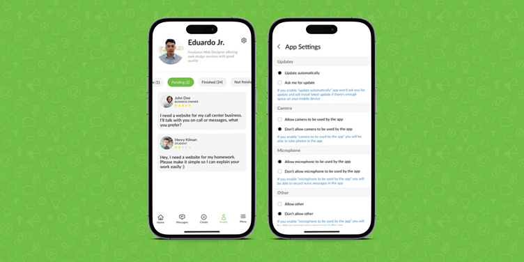
Profile & Settings
The profile page shows basic information about the client and gives him the opportunity to edit his profile. Below the basic information is a bar with status tabs. These tabs describe the status of jobs you have done or are already doing.
Usability Testing
I shared the prototype with several people who would like an app just like this, and the whole design seemed simple and not at all confusing. There are definitely features that could be added to complete the application, but this is the base of the application.
Conclusion
I enjoyed the few weeks that I spent designing this app. I definitely notice a difference compared to when I started, and certainly, my knowledge of graphic design contributed.
Contact information
