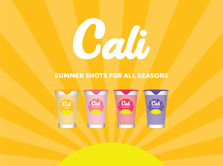
Cali Shots - CPG Consumer Product Branding and Packaging
We Were Hired For
Branding strategy, naming, logo, packaging, web concept.
Background
We were hired to create a new alcohol shot brand from scratch. The remit was to create something ‘summery’ and enjoyable that didn’t conjure up images of irresponsible drinking like other brands in the market.
Brand Name
The market for shot drinks was already flooded with names that remind people of exactly what they’re drinking. We were drawn to the brief to create something ‘summery’ and as the brand was based in California, we didn’t have to think for long.
Inspiration
Logo
Inspired by the font used in the inspiration image, we sought to create a relaxed and distinctive logo that could be used across all color options.
Packaging
The different flavors represent the different colors of the California sun as it's setting.
For the box packaging we knew these would typically be sold in a large liquor store so we made it very simple for consumers to see what was inside. We also took the opportunity to color three sides of the box differently so they can be stacked in stores to display the different flavors as shown below.
Website Concept
We designed a fully responsive website concept. On mobile the four different flavors will constantly be looping.
Brand Imagined
Hit that "L" key if you like it ❤️ Thanks!


