Legoland magazine layout
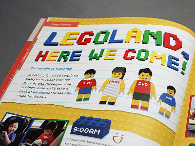
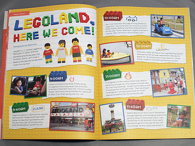
This is a magazine spread designed for Kaixine, Singapore's first creative magazine for young kids. This spread documented a child's trip to Legoland with his family.
This was a ton of fun to design! Since the trip was to Legoland, the design was heavily inspired by Legos. A couple design decisions: journal entries written on lined paper placed on top of a Lego background, hand-drawn elements, the Lego color scheme, a handwritten font, etc.
Fun fact: the headline was built from actual Legos and photographed!
More by Maple Kuo View profile
Like


