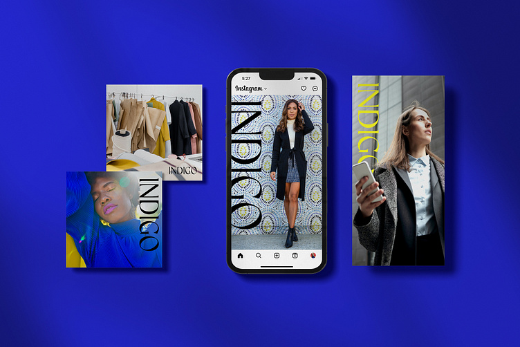
Indigo
The Brief
Indigo is a fashion company that sells sustainable business clothing. Their items are made from high-quality materials and are shipped directly to your home. Target audience is woman in business who love high fashion from day to night, though they have a men's line as well.
They want to convey a sense of fame, while at the same time being gentle. There isn't much concern on bringing the sustainability aspect into the brand identity, as they will focus this message within their marketing efforts elsewhere. They prefer a wordmark and brand assets that will work well online, on their clothing, and in the packaging presentation, as these are the main touchpoints with their customer.
The Logo
The logo design is simple and suggests high fashion. Slight curves added to the stems of the I and bowl of the D soften the typeface without losing structure.
The Colors
To coordinate with the name, a bold blue was chosen as the main color of the brand, though the logo is always used in black or white. Blue as an accent can signal serenity but also enthusiasm, imagination, and reliability. It is used sparingly in marketing materials to draw attention when needed - but produces a strong, recognizable color for shipping and packing materials.
To counter the blue we have a bold yellow which, when used sparingly, produces a warming effect, arousing cheerfulness and grabbing attention.
The Patterns
A big emphasis was placed on the patterns for the brand, as they should be usable in any combination in all shipping and packing materials. The pattern designs range from simple and linear to bold and messy to create a variety of moods for the brand and a slightly different experience for the customer each time they place an order.


