SoulSessions - Logo
EDIT: This product did not end up launching but I am still allowed to show the work I created. This case study language is still written from the perspective of a launched product.
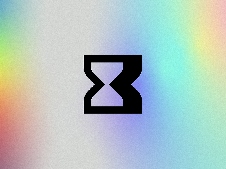
I recently had the opportunity to create a logo for a music-first focus and relaxation app–SoulSessions. SoulSessions exists to let the user be in the moment, whether that's studying, reading, hustling, resting, or relaxing. SoulSessions encourages you to be in the here and now. I wanted to capitalize on that and take something that would normally be used for keeping time and turn it into something that would make time disappear. The SoulSessions empty hourglass mark symbolizes that transparency and calming feeling, ultimately not worrying about time slipping away because you're living in the moment.
A mark for every occasion
It was important to create a mark that could scale well and be recognizable no matter what background it was on. I had created a proper reverse logo instead of just taking the positive logo and making it white. That's a big red flag and all-too-common faux pas.
Thank You
I'll end this case study with how I reveled the logo to the client in the presentation. Huge shoutout to Chris Zachary who helped me clean up and complete this animation I attempted to make on my own.
Like What You See?
I have limited availability but would love to know if you think I'm a good fit for your upcoming project. Reach out through my website or directly through Dribbble. Thank you!


