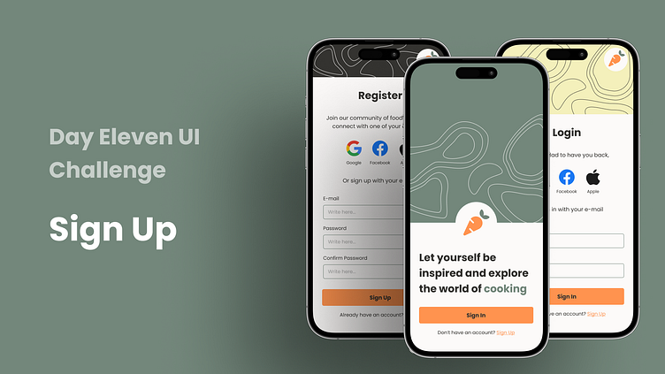
Day 11 UI Challenge - Sign Up
Hey Dribbblers! 🍳👋
I'm excited to share with you my latest project: a sign-up page for a recipe app! In this post, I'll walk you through my design process and explain the decisions I made along the way.
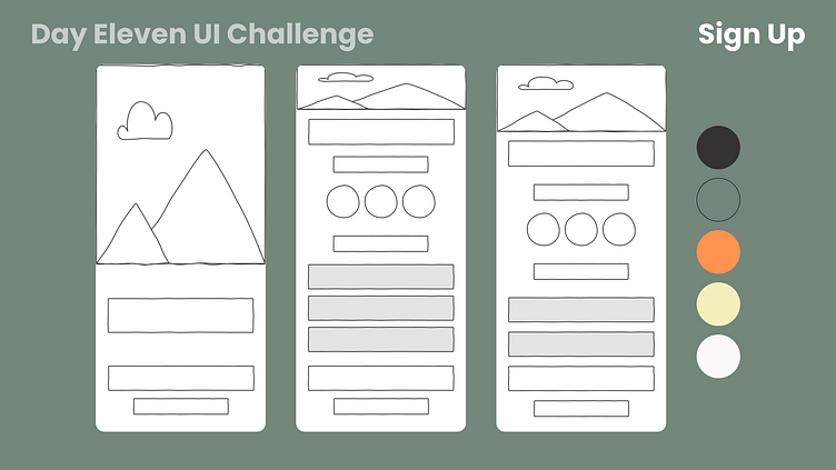
First, I started with low-fidelity mockups to experiment with different layouts and understand the overall flow. I wanted to create a sign-up page that was simple and easy to use, while still being visually appealing. After testing several options, I settled on a layout with third-party sign-in options, like Google, Facebook, and Apple accounts.
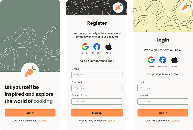
Next, I turned my attention to color. I wanted to use a color scheme that would be both appetizing and on-brand for a recipe app. I chose a warm, earthy palette of yellows and oranges, with pops of green to represent fresh ingredients.
Finally, I created high-fidelity mockups to bring the design to life. The final product features a clean, modern sign-up page that's both inviting and easy to use. Check out the last image of this post to see the finished design!
Thanks for checking out my work, and as always, feedback is welcome and appreciated! 🙏
