Desktop analytics dashboard
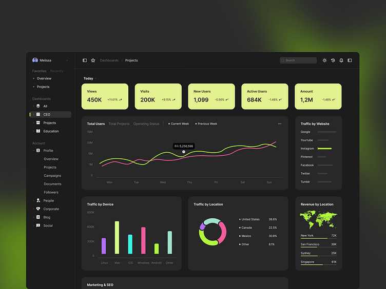
Hey, friends! Check out how we designed an analytics dashboard to manage marketing and sales channels💹, analyze traffic📉, track their results 📊 and find new opportunities. The dashboard helps monitor achievements and key indicators, view trends, and estimate risks.
This dashboard displays detailed information about marketing and sales activities and results with graphs and pie charts that make the statistics easier to perceive. The precise information layout makes the pages easier to navigate.
On the left, there is a sidebar. Next to it are the leading indicators and stats on views, visits, and new and active users. Graphs and pie charts reflect the number of users for different periods, sources of traffic, traffic by device and location, and revenue by location.
Keeping the background black, we added vivid lemon accents to outline the main stats and UI elements. Such accents give the page an airy look. The dark background of this interface helps users concentrate on the page's contents.
The unique characteristics of this design are juicy tones and simplified forms without extra shadows and outlines that make the significant elements stand out. The precise information layout and minimal design will turn the routine of managing traffic into a more pleasant task.
Press "L" if you like it, and let me know what do guys think in the comment section 🤔
