Blacklight Branding

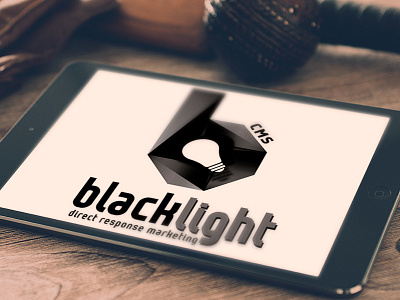

BlackLight’s identity blends the “B” in BlackLight with a bulb to represent both the ideas and clarity that the Black Light system gives to its clients. The 3D “B” symbol is unique to their brand. Hidden within the symbol is many angular facets which represents the many types of services the BlackLight product offers. The distinctive black and grey tones were chosen to set the brand apart from the numerous competitors in the marketplace.