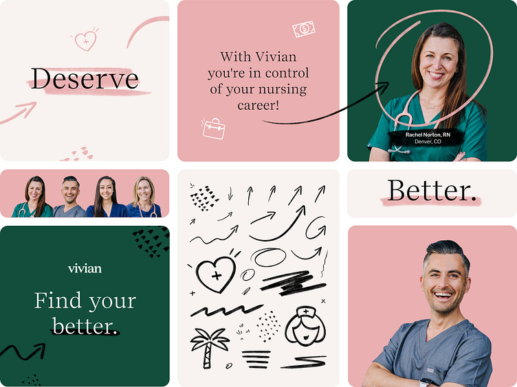
Better Campaign Visual System
This project is long overdue but still love how this versatile visual/design system turned out. Back in 2022 we launched our first large scale brand campaign, once the strategy and messaging was finalized — then came the challenge of designing meaningful visuals for the campaign, the visual system needed to be flexible to work across digital and print and motion deliverables. We explored numerous visual concepts but the finally landed on what you see above — the hand drawn visuals (scribbles, arrows, circles, icons, and underlines were inspired by how healthcare professionals take notes, write prescriptions, and write on whiteboard at their jobs. The campaign was a huge success in terms of brand awareness, HCPs loved the whole campaign and appreciated how it related and spoke to them. Let me know what you think! Also be on the lookout for the v2 of this campaign, I'll share more soon!
