LL14
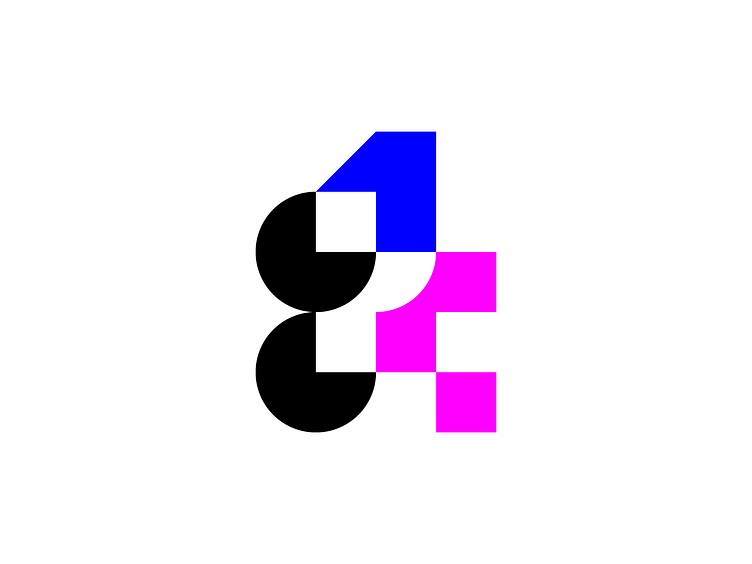
Logo proposal for LogoLounge Book 14
Made of basic shapes:
The circle, the square and the triangle.
Circle shapes with black color helps to pick letters (LL) out of entire logo.
Number 1 & number 4 have different colors, sizes & perspective angles.
Number 1 standing above of number 4 symbolizes competition between uploaded logos.
Lighter color of number 4 and negative space around it makes it look less heavy & balances the logo.
More by Irakli Dolidze View profile
Like

