Forms Again
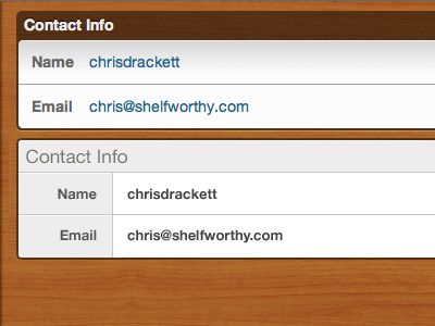
As I work on the new shelfworthy I often go back and review the current site. When looking at our old forms, part of me really started missing something about them. This is just a first pass at the old forms to see what they look like in comparison to the form I did earlier this week.
The vertical sizing seems odd to me, but what I do like about the forms with the gray is the separation between the label and the form element.
Any feedback?
More by Chris Drackett View profile
Like

