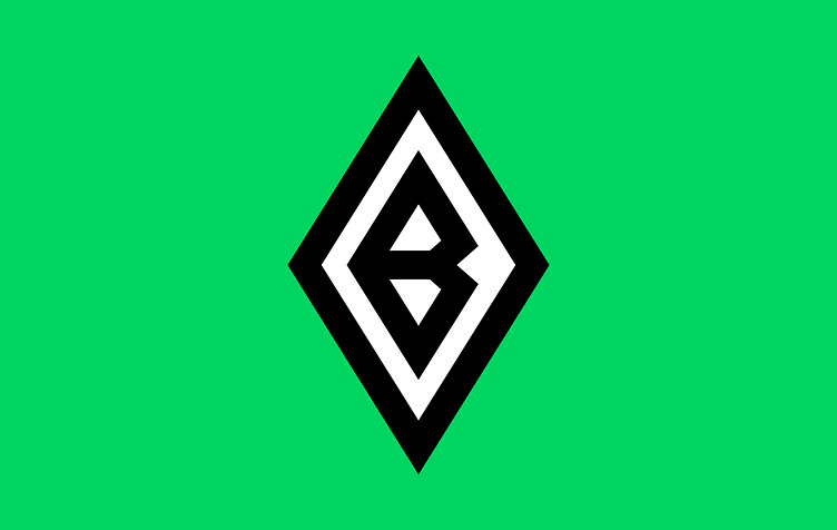
Borussia Mönchengladbach
The new design of the Borussia Mönchengladbach logo is simpler and more minimalistic compared to the previous version. The letter "B" is now shaped like a shield, which is a common symbol used in club logos to evoke a sense of strength and protection. This design element reinforces the idea that Borussia Mönchengladbach is a strong and resilient team.
The changes made to the logo have resulted in a more streamlined and modern design, while still retaining the key elements that make it easily recognizable as representing Borussia Mönchengladbach.
More by Ensar Sever View profile
Like
