Moika laundry branding
Задача:
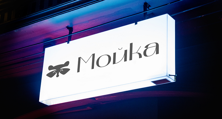
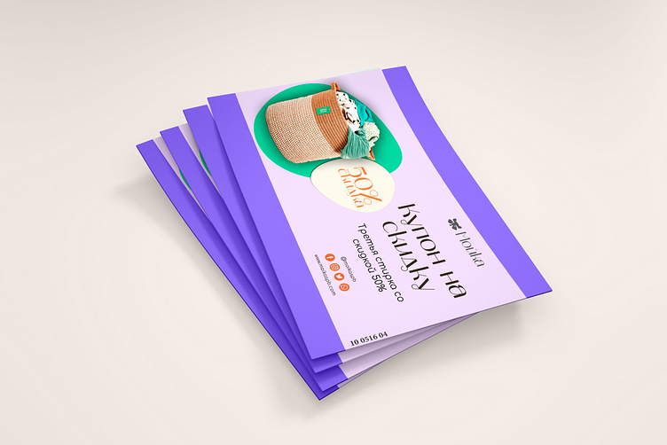
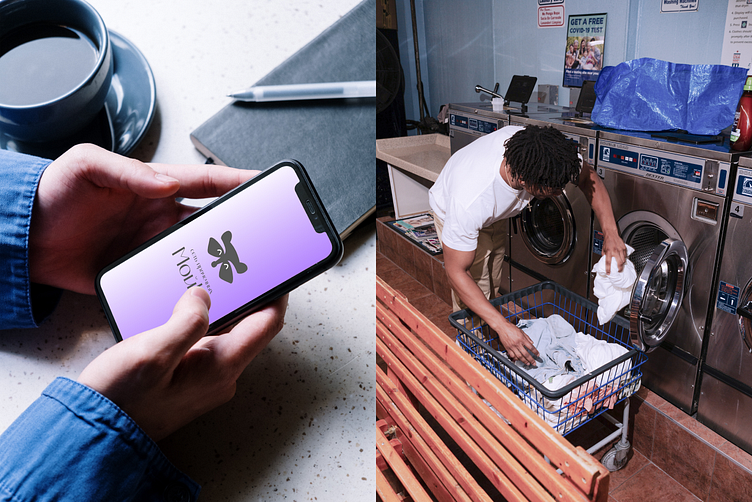
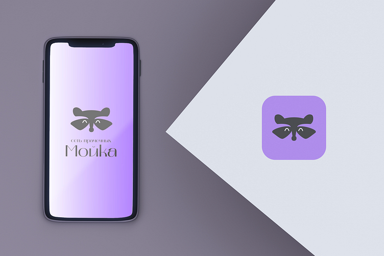
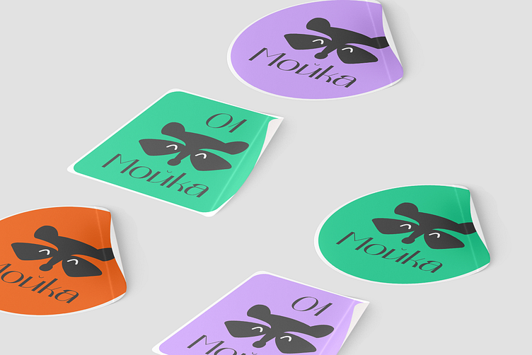
Разработать минималистичный логотип прачечной "Mойка" и цветовую палитру для вывесок, рекламных листовок, брендирования техники. Носители: логотип должен читаться на иконке приложения и полиграфии.
Решение:
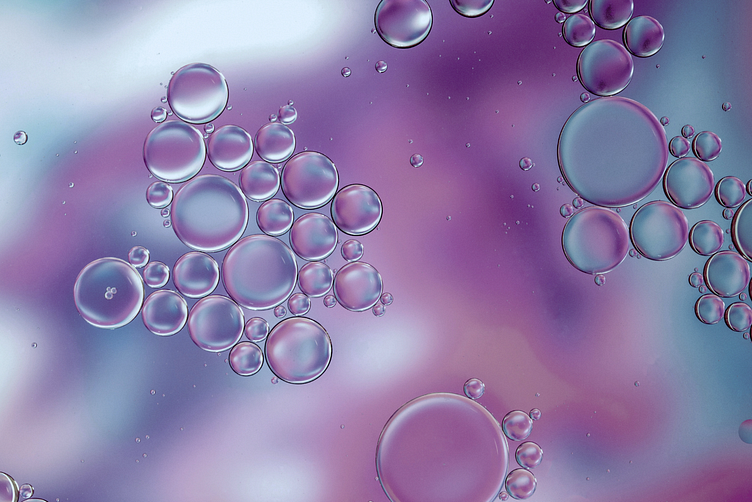
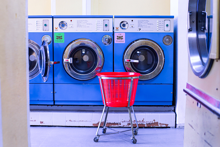
"Mойка" — это сеть круглосуточных прачечных самообслуживания в г. Санкт-Петербург. "Мойка" отличается от конкурентов тем, что у них есть техника для УФ-дезинфекции белья. Поэтому был сделан выбор в пользу фиолетового оттенка, который также является цветом свежести и технологий. Основная целевая аудитория — мужчины 25-30 лет, обычно холостые. Было принято решение добавить серый цвет в логотип.
С помощью карты ассоциаций был выявлен персонаж енот, он стирает одежду, как и "Мойка".
EN
Task: To develop a minimalistic logo of the laundry "Moika" and a color palette. Media: the logo should be read on the application icon and printing: signs, flyers, discount coupons.
Decision:
"Moika" is a chain of 24—hour self-service laundries in St. Petersburg. "Moika" differs from competitors in that they have a technique for UV disinfection of laundry. Therefore, a choice was made in favor of a purple shade, which is also the color of freshness and technology. The main target audience is men 25-30 years old, usually single. It was decided to add gray color to the logo.
With the help of the association card, the raccoon character was identified, he washes clothes, as well as the "Moika".
Спасибо за внимание! Связаться со мной можно с помощью telegram и почты arovamaria.art@gmail.com
Thanks for your attention!
