ARCHITECTURE COMPANY LOGO
I am excited to share my latest logo design for an architecture firm, which is proudly displayed on my Dribbble account. This logo is a reflection of the elegance, creativity, and innovation that are synonymous with the world of architecture.
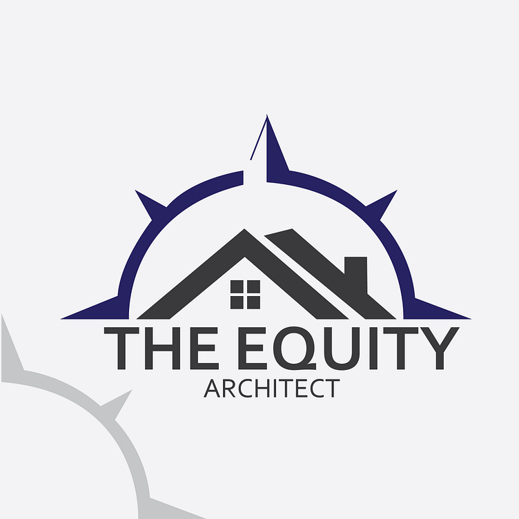
The logo is designed with a simple yet powerful concept that captures the essence of the brand it represents. It features a sleek, minimalist design with clean lines and bold typography, which creates a modern and professional look.
The color scheme used in this logo is sophisticated and timeless, with a muted palette that includes shades of gray, blue, and black. The muted color scheme was chosen to complement the elegance of the architecture industry, while the blue highlights bring a touch of modernity and innovation to the design.
The typography used in the logo is simple, yet bold and eye-catching, making it easily recognizable and memorable. The use of negative space in the logo design adds depth and dimension to the design, making it more visually interesting.
Overall, this architecture logo design is a perfect representation of my ability to create a logo that truly captures the essence of a brand. It is simple, elegant, and timeless, making it a perfect fit for any architecture firm looking to establish a professional and recognizable brand identity.
I am confident that this logo design will help to elevate the brand's image and enhance its reputation as a leading player in the architecture industry. It was a pleasure working on this project and I am excited to create more impactful designs for my clients in the future.
