Darkmode Martial Arts Studio
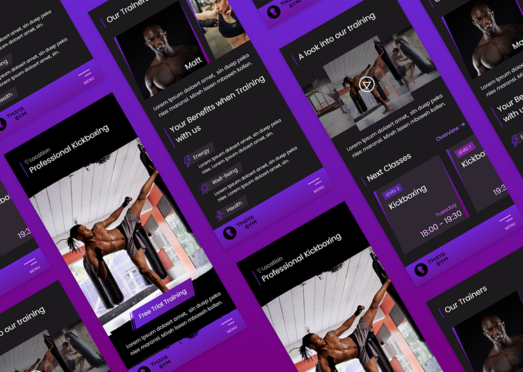
This mobile-first design for a kickboxing studio features a strong purple color palette and gradient effects that convey a modern, fresh, and youthful look. The dark mode color scheme adds a sleek and stylish feel that's perfect for a fitness brand.
The non-serif font used throughout the design is bold and easy to read. The layout is optimized for mobile devices and features clear navigation that makes it easy for users to find the information they need.
High-quality imagery and graphics showcase the kickboxing studio's facilities and services, creating a visually appealing and engaging user experience.
Overall, this design is a great fit for a kickboxing studio looking to attract a young and dynamic audience. Its functional and visually striking design is perfect for showcasing the studio's brand image as a fun and challenging fitness experience.

