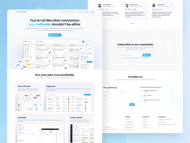
Landing Page for the operating system for glass contractors
Hello 👋, we would like to present you a concept landing page design that we created for our client from New York.
We usually don't design for a landing page and this is not our goal, but since this is our current client for whom we designed a web application, we also proposed this landing page concept to them😉.
How it looks in Figma 👇
When we create a design, it's not just a beautiful picture. We always consider all the stages that come after the design phase.
Designers need to ask themselves questions like:
What will happen when you click on this button, what will the user see?
If there is a slider, what will happen when it switches to the next slide?
How will this look in the mobile version?
What should the user see after filling out and submitting the feedback form?
Where should the developer find all the necessary images used in the design?
We always contemplate these aspects and provide everything needed for development! As a result, the client receives not only a beautiful image but also all the necessary materials and guides, comments, and explanations on how it should work.
It would seem that these are ordinary standard things, but very often freelancers forget about it 🤷♂️.
📣 Customer Feedback
We would like to share the feedback from the client that he left us after our work on the web application. You can check it out on our Clutch
Thank you for your attention! 🙏
If you have a potential project and want to work with us, write to us on our email:


