SPA NIDA BROCHURE DESIGN
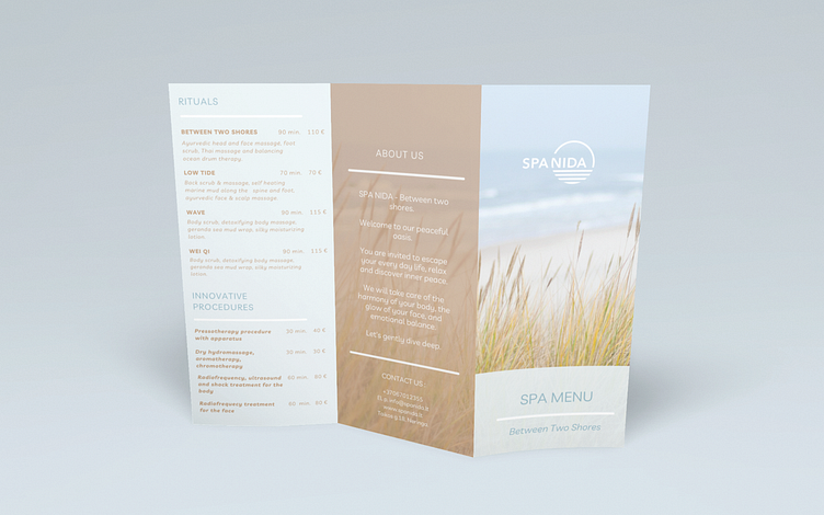
For this project, I wanted to create a design that would represent a relaxing atmosphere of the SPA by the sea. To achieve this, I used a clean and minimalist layout, with bold headings and easy-to-read text.
The colour palette I chose was a mix of light blues and browns, giving the brochure a modern and professional feel.
Overall, I am thrilled with the final result and believe it effectively showcases the benefits of the SPA in a clear and concise way.
If you're looking for a brochure design, I would love to work with you on your next project!
_____________________________________
Inquiries: info@wildflowcreate.com
More by Wild Flow Create Studio View profile
Like
