Case Study - Foodie App
About App
The Foodie Mobile App is a software program that permits its users to place food orders and make restaurant reservations via the internet. The application comes equipped with several features, including product search, reviews and ratings, restaurant specifics, and promotional offers.
Users can also create and save a list of their preferred foods and eateries, view their past order history, and track the status of their present orders.The app is available for both iOS and Android devices and seamlessly integrates with third-party delivery services and online payment gateways for a hassle-free user experience.
Wireframes
Producing wireframes is a crucial step before commencing screen design, as it allows us to preview the app's appearance and functionality prior to investing significant effort and resources into the project.
Generating wireframes enabled me to conceptualize the app's functionality, key features, and user interactions visually, which proved extremely beneficial before initiating any main screen design.
Onboarding Screen
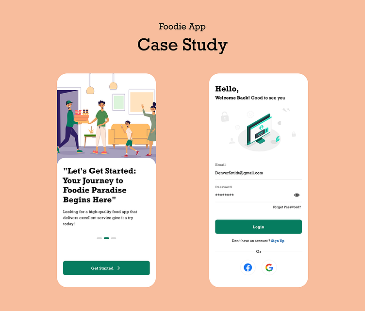
When a user first launches the Foodie Mobile App, they will encounter a series of onboarding screens. These screens serve the purpose of acquainting the user with the app's various features and functions, as well as guiding them through the setup process. Typically, the onboarding screen consists of text, images, and interactive elements, all of which are used to illustrate the app's essential features and demonstrate how to use them.
The onboarding screen of our app provides a comprehensive overview of its many benefits, as well as detailed instructions on how to use its features. This includes showcasing why we are the best and demonstrating our unique approach. To encourage users to get started using the app, a clear call to action is prominently featured, such as a prominent button that leads directly to the main features of the app.
Login Screen
The login screen is a vital aspect of our app, as it serves as the entryway to all subsequent screens. Upon completing the onboarding process, users will be greeted with a welcome message on the login screen, where they must successfully log in or create an account to access the home screen.
To further streamline the login process, users can opt to sign in using their existing social media credentials, including Facebook or Google. This added convenience eliminates the need for users to remember yet another set of login credentials, making it easier and more efficient to access our app.
Home screen
The home screen is the primary interface that the user encounters upon launching the app. It usually offers immediate access to the app's primary features and functions, such as searching for food and restaurants, displaying various eateries based on ratings and other categories, adding products to the cart, and placing orders.
The home screen featuring a range of essential components to enhance the user experience. A search bar is available to quickly find desired products or restaurants, while a list of recommended or popular items is prominently displayed. A navigation menu allows seamless access to all parts of the app, and a button to view the user's account or profile is easily accessible. Additionally, promotions and discounts are featured to incentivize users to make purchases and enhance their overall experience.
Restaurant Detail Screen
Foodie App product details screen is a page that displays detailed information about a specific snack product. The purpose of this screen is to provide users with all the information they need to make an decision regarding reservation.
The screen typically showcases a high-quality image of the restaurant or product, along with essential information such as the product name, brand and a brief description. It also offers additional details, such as popular dishes, the location, distance and user reviews/ratings.
The screen not only displays essential information but also features user-friendly buttons to enable reservation additions or cancellations. Its visually pleasing layout presents information in a clear, concise manner that is easy to navigate. The screen is optimized for various screen sizes and resolutions to provide a seamless user experience. Overall, the product details screen is designed to facilitate reservations by providing all the necessary information and simplifying the process for users.
Hello Dribbbers!
Kindly provide your valuable feedback on my project and suggest any ideas or thoughts on how I can further improve it.
If you appreciate this project, kindly express your support by liking and commenting. Thank you!


