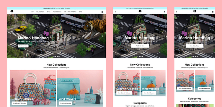
Min & Mon Homepage Redesign Case Study
The goal was to redesign the homepage of this e-commerce website making it easier to navigate and focusing on brand identity. I wanted to create a more engaging experience that would entice the users to click through additional pages by presenting the products in a more fun and engaging way.
By taking the time to understand the brand and their designs I was able to collect some of their images and illustrations to use on the homepage creating a more interesting and artistic reflection into the world of Min & Mon.
Thank you!
If you would like to see the full case study please check it out on Behance.
More by Cathy Attix Villamar View profile
Like
