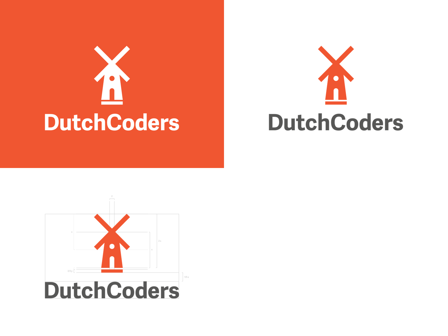
DutchCoders Logo
Despite being extremely simple (goal achieved), this was probably one of the most difficult logos I've ever worked on. I went for something that:
- Maintained their windmill logo so branding wasn't completely different (that would be unnecessary) - Scaled beautifully (as you should) - Was representative of Amsterdam/The Netherlands - Geometric with sharp edges to give the brand itself a bit more edge
A *huge* thank you to @Benedikt Lehnert for the immense amount of help and feedback he provided on this project. <3
More by Cat Noone View profile
Like
