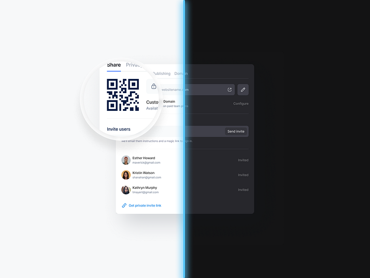
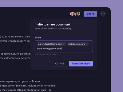
Share Dialog Modal - Dark & Light Modes
Hey Dribbblers 🏀,
Allow users to switch from normal to dark mode. It is tempting to let the system decide when to turn the dark theme on or off. However, such a design decision can lead to bad UX. By doing this, you are taking control of the user and forcing the system to decide for them. That's why it's better not to use an automatic dark theme on. Allow users to enable (or disable) the dark theme through a UI control. Users should be able to select the mode manually based on their own needs. You need to position and design the mode switch.
Use the lighter color scale to translate the height. Avoid using shadows in dark mode. Instead, use the border property to highlight depth levels for UI elements. Removed elements should still have a lower height compared to closer elements. Avoid using shadows in dark mode. To better convey depth - make sure that objects closer to the user are brighter. This will help build a better visual hierarchy.
Design light mode firstWhile bringing your designs from light to dark mode, keep all the visual cues in place. Don't ignore or remove some colors for the sake of a dark theme not to confuse users. Instead, prepare a color pallet that focuses on inverting existing colors without UI losing efficiency.
Use base colors to design dark mode to make it predictable turning your light-themed UI to the dark side. Use a set of base or "neutral" colors with the same transparency values from the very start of your project. A set of transparent colors can ease your life a lot. Instead of constantly choosing different shades of gray, you can use a set of transparent colors to convert your designs to dark mode predictably.
Hope you like it and feel free to leave comments and feedback.
Don't forget to press "L" if you enjoy watching this ❤️.
📩 Reach me at: dm.sergushkin@gmail.com
—
✨ My social Behance | Linkedin | Medium | ux.sergushkin | Instagram | Dribbble

