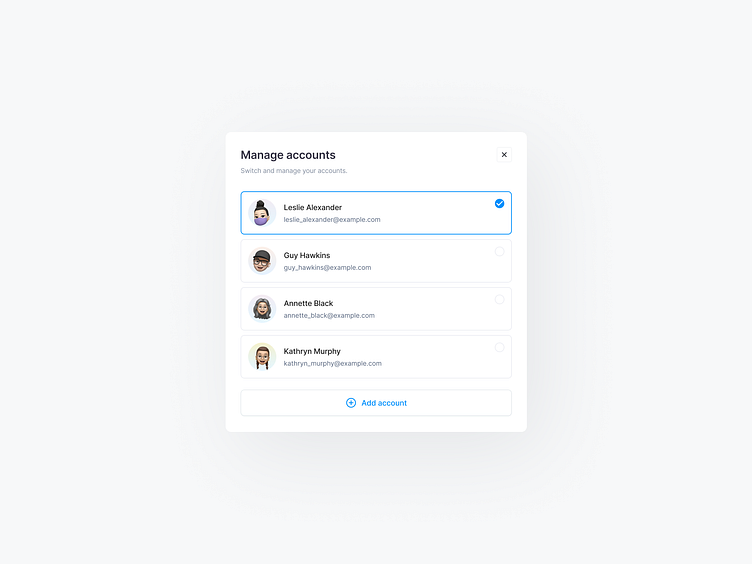
Accounts modal
Hey Dribbblers 🏀,
Getting the user’s attention, keeping context and simplifying the UI are great benefits of modals. Every modal needs a header, X button, content area and footer. The header is where the title and “close” icon goes. The title is necessary to affirm to the user what task they’re doing.
❖ Header. Your header is the first bit of text that your customer will see. As such, it needs to immediately explain the purpose of the modal. If it’s too confusing, your user will click away without a second’s thought. Ideally, you want to refer explicitly to the desired action that you want your user to take.
❖ X button. If the user doesn’t click on the CTA button, they need some other way to exit the modal. Otherwise, they’re just going to get annoyed with you, especially if whatever they were doing before your modal interrupted them was important. Ensure that your X is as visible as possible by maintaining a good colour contrast between the X and the colour of the modal itself.
❖ Content area. The body (or “modal dialog,” if you want to get fancy) is the main section of text that customers see on your modal. Keep it as brief as possible, using bullet points wherever you can. Your goal should be to help users understand the value of the modal to them in 2-3 seconds.
❖ The Call to Action, or CTA for short, is where you drive your user to do whatever it is that your modal is set up to lead them towards. It’s normally in the form of a button that the user needs to click on.
Hope you like it and feel free to leave comments and feedback.
Don't forget to press "L" if you enjoy watching this ❤️.
Thanks for checking it out!
If you have comments, let me know!
Say hello at 📧
ux.sergushkin@gmail.com
Visit my Website 🌎
dmitrysergushkin.com
For more inspiration, visit my profiles ✨

