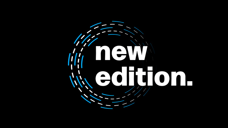
New Edition Logo Design
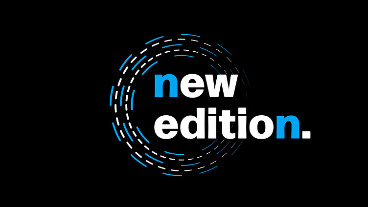
The inspiration for this design came from a song, I didn't want to overthink it, but I like the design because the lines fade out where the letters come into play through the circle. The shades of blue for the letter "n" on either side of the design also is a nice addition in my opinion. There's also a version where the lettering is all white. Let me know what you think!