Omega - Logo & brand identity for the financial service company

Client's story
Omega is a financial service whose name speaks for itself. The letter omega became the youngest and last in the Greek alphabet, so in the financial sphere, Omega will become the first and best financial service solution for business.
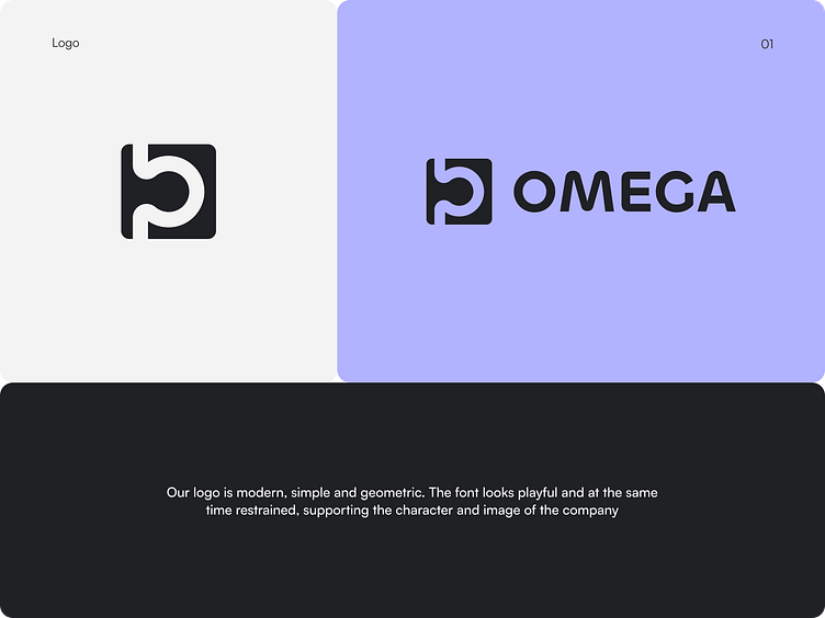
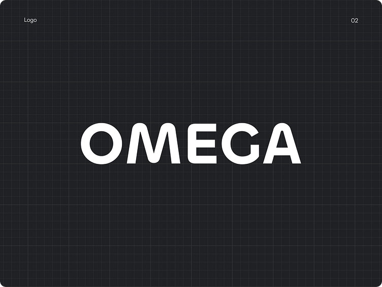
Logo design
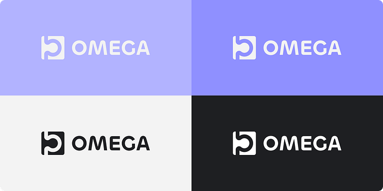
The logo is a reworked symbol of the omega, conveying images of path, communication, and unity.
Restraint, fluidity of forms, and at the same time ambition and energy of resistance to usual standards form the image of the monarch above other similar services.
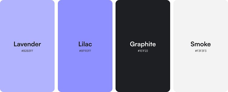
Color palette
The color scheme is represented by a combination of purple shades with black and white, which gives a sense of the seriousness of the company with hints of emotionality.