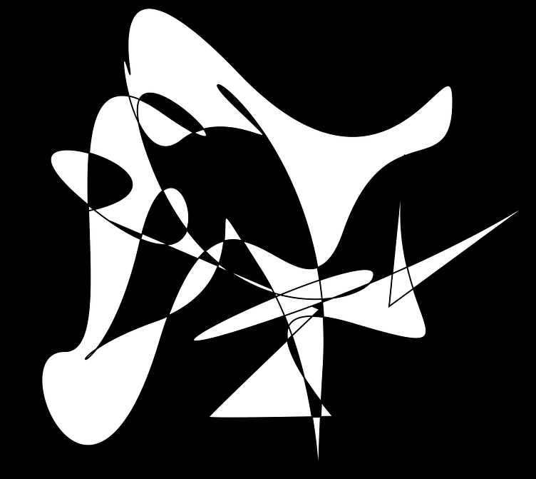
Abstract Movement
For the black and white abstract graphic design, my inspiration came from my own natural movements and flows. I've always been fascinated by the way that our bodies move and interact with the world around us, and I wanted to capture that in my design. I also drew inspiration from the natural flow of ink on paper, which I thought would complement the organic shapes and lines in the design.
I began the design process by experimenting with different types of brush strokes and ink textures. I wanted to create a design that looked fluid and organic, almost as if it was in motion. After several iterations, I settled on a series of abstract shapes that resembled the flow of water or wind. I used thick brushstrokes to create bold lines, while thinner lines added a sense of delicacy and intricacy to the overall design.
Next, I worked on creating a sense of balance in the design. I used negative space to create a contrast between the black and white elements, while still ensuring that the design felt unified and cohesive. I played around with the position of the different elements until I felt that they were arranged in a visually appealing way.
Finally, I made some finishing touches to the design by adjusting the line weights and textures to ensure that they all worked well together. The final result was a black and white abstract graphic design that flowed and ebbed in a natural and organic way.
Overall, creating this black and white abstract graphic design required a combination of technical skill and artistic vision. By drawing inspiration from my own natural movements and flows, and experimenting with different textures and line weights, I was able to create a visually appealing design that captured the fluidity of the world around us.
