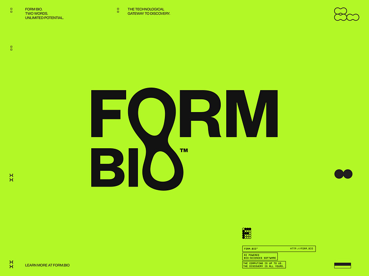
Form Bio Brand Identity
The formation of a new identity.
Design is all about form & function. For our client form is literally in their name– Form Bio Sciences, a company that takes complex scientific information and simplifies how it is used and shared. The Maven team took a really close, you could say we took a microscopic look at what elements we could use to represent the company. Where we landed was on an organic form that represented the scientific shapes often found when looked at under deep magnification. Organic, biomorphic, scientific, cool, fun, playful– Yes, to all those things and more.
Art Direction Rationale
The black and white reticulated background images are intended to resemble the lack of color in Electron Microscopy. The black and white + reticulation effect combined with abstract shapes and vibrant macro photography lay the foundation for the visual brand identity.


