Streaming Service Concept
This project was created as part of Dribbble’s Product Design Course
My Role - Product Designer
User Research
Competitive Research
User Testing
UI/UX Design.
Tools used:
Figma
Problem Statement
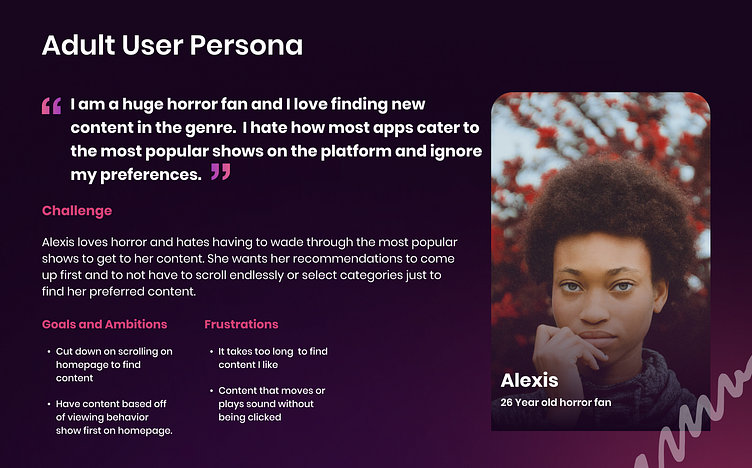
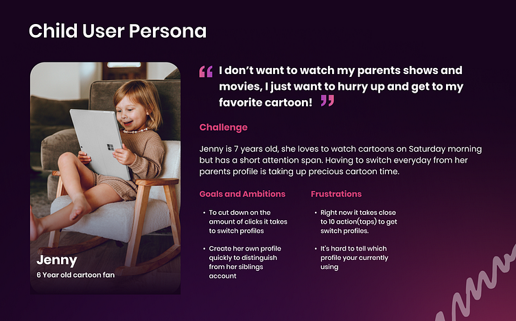
For this app I was given a user persona for a child with the goal to make switching user profiles easier as this app did not have this functionality.
I dove deeper into this application and discovered frustration with adult users around how content was displayed and how suggested content seemed impersonal despite sufficient user data to display relevant content.
Goals:
Easy to switch user accounts
User preference based content
Content differentiation
Project Scope
Select profile page
Homepage
Content detail page
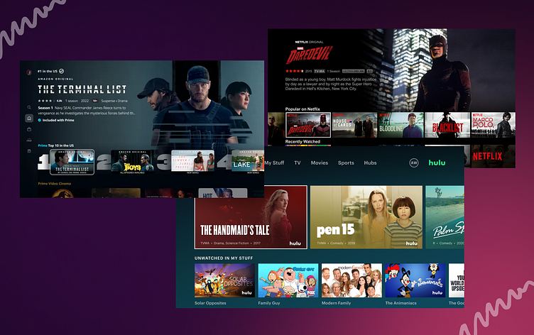
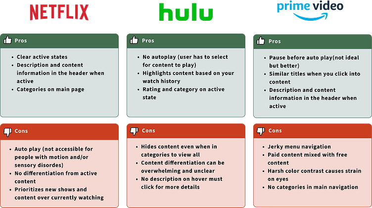
Competitive Research
For this project I researched the top 3 streaming services to analyze the pros and the cons of their designs and features. Analyzing these apps and asking friends and family their thoughts helped to uncover the best and worst of the apps to guide design decisions.
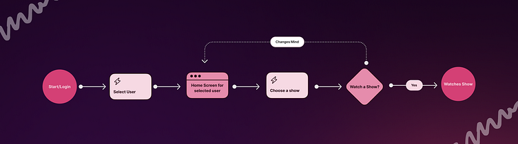
User Flow
For the user flow I focused on the flow for selecting a user and finding a show from the homepage since this is the main functionality concern for the app.
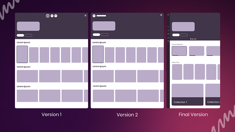
Wireframes
I tested several design layouts for the homepage using wireframes. The feedback gathered led to my final V3 design.
Testing notes:
Prioritize continue watching
Differentiate active content vs. non-active
Move navigation to the sidebar
Allow to click for more details instead of add to list
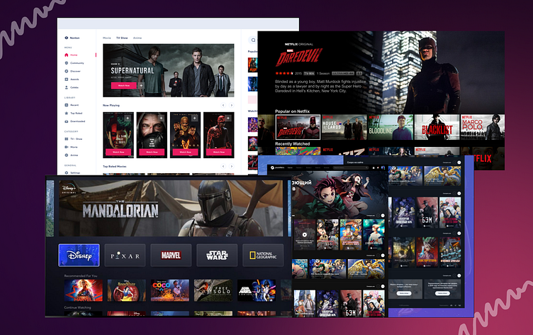
Inspiration
For this project I was provided with four streaming apps for inspiration. These apps all utilized different layouts and organization of content but all followed UI patterns that allows for users to easily navigate between different apps.
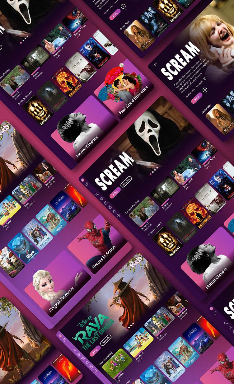
Visual Design
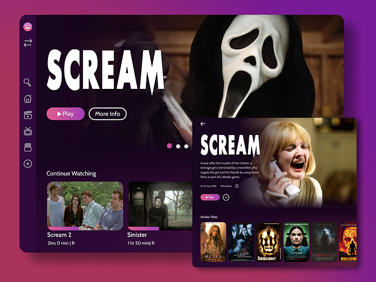
I used UI patterns from the content streaming space, including references from video and music streaming services. For example"Continue Watching" content needed to differ in style from the suggested content. This was not only in shape and size but also utilizing design cues such as a progress bar to show recent activity. This allows for faster differentiation between the different types of content at a glance.
Collections were created to group content based on a mood or subject. This mimics what is used most commonly in music streaming apps but has recently been added to other movie streaming apps such as HBO Max. These are larger and more stylized than the other content with titles on the card.
There are three different content card designs depending on activity:
Continue watching
Unwatched content
Collections
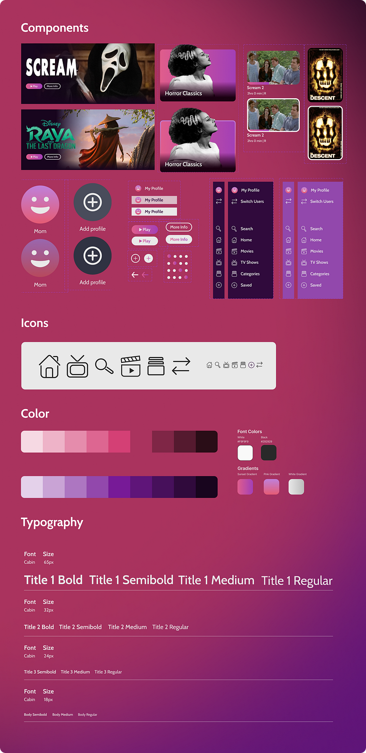
Design System
I created a design system for the app to help guide future expansions as well as assist with developer hand off.
This system includes:
Interactive components
Icons
Colors
Typography
Prototype
For the prototype I went through both the adult and the kids user flow showing the different hover stats and the user flow of selecting content. View the full video prototype on YouTube.
Final Thoughts
Utilizing user testing during the wireframes design period proved to be extremely helpful in creating a more refined visual design utilizing user feedback early on. I plan to run another round of user testing with the completed visual design and to make edits and run A/B tests. I hope to continue to add to this app experience to explore the full user experience.
Next steps for this project:
User testing
A/B testing
Variations
App expansion
