Orca Transit App-Winter 2021

This project aims at creating a product that would help Orca card users modernize and streamline their commute process.

Problem identifying & Information Architecture
The first step I took at creating this product was identifying key problems that commuters may face. These problems include:
Current app did not have a Trip planner/map for riders
University of Washington students could not add their Husky card to app
You could not use your phone as way to pay on transit
After identifying those key problems, I created a graphic designed at showing how a user may navigate the app and complete tasks easily.
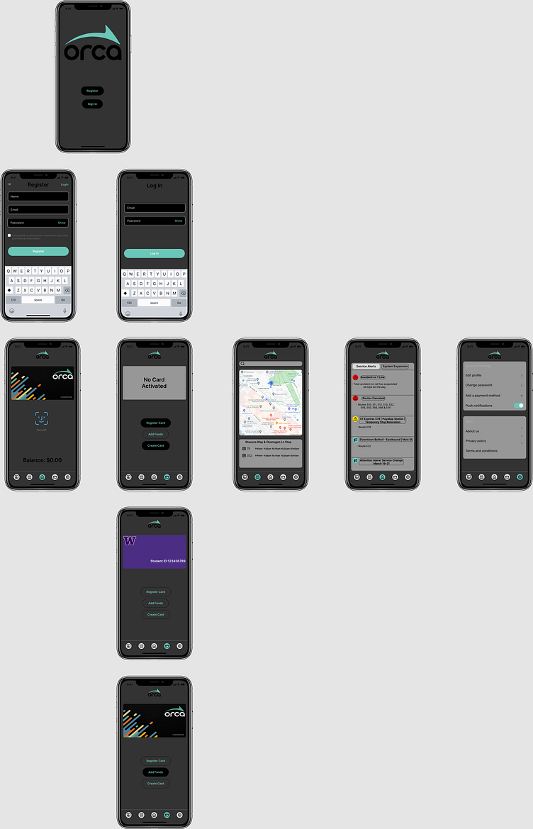
Hi-fidelty mock up
The design above reflects the how I'd envision my solution for Orca card/U-Pass users. A simple design would allow for users to easily navigate to what they need. The product would offer a way for users to to pay for transit fares without having to carry around a physical card, this option would also be beneficial for UW students as they would be able to add their information and be able to ride if they forgot their UW ID. The trip planner would allow riders to easily find their next bus without having to use another product. The alert tab also provides vital information for daily commuters.
Outcomes
This was my first attempt at creating a design that included information architecture along with Hi-fi mockups. I learned that its important to have a flow chart of how you want a user to navigate a product in order to have a sense of how the final product should work. A mistake I made was jumping straight into the hi-fi product without any lo-fi mockup or even wireframe, if I had something like that I feel I would have a more polished product. The main takeaway from this design that I got was being able to create something that addressed a user's problem and attempted to solve it.
