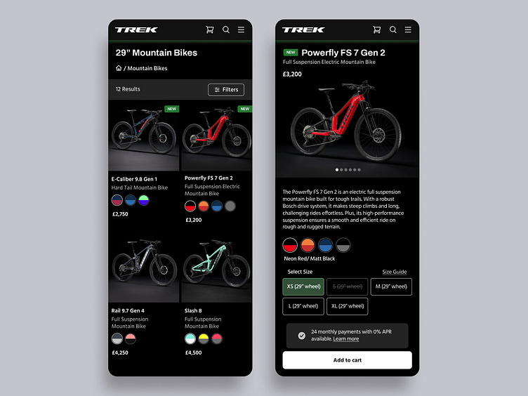
Bike Brand Mobile E-Commerce Page Dark - Trek Bikes Re-Design
I love bikes so I decided to re-design the Trek Bikes e-commerce pages. I have kept the products in a 2x2 grid, following the Shift Nudge assignment constraints on the Combining Text and Elements lesson from the Typography module. What do you think - light or dark?
👋 Get in touch with me on hi@illydesign.xyz
More by Illy Dimitrova | illydesign View profile
Like

