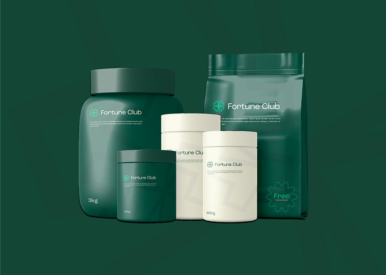
Fortune Club logo & brand identity design
Fortune Club is a healthy supplementation brand looking to change the archaic supplement industry through a disruptive tone of voice and massive goals. They needed a brand that felt honest, conscientious and informative.
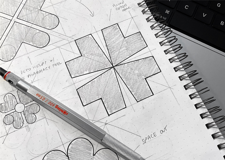
As with all briefs, I jumped into research and word mapping to build out some fertile territories and found myself going down a 4-leaf clover route representing the ‘fortune’ element of the brand. Then I set my mind to sketching during the initial ideas stage of my process and came up with many different executions of this idea. I developed the strongest options further and narrowed them down to a select few. We chatted through these during our presentation and both agreed that the angular 4-leaf clover/4 converging hearts idea was where we should focus.

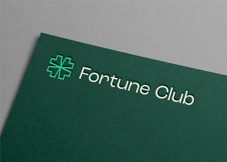
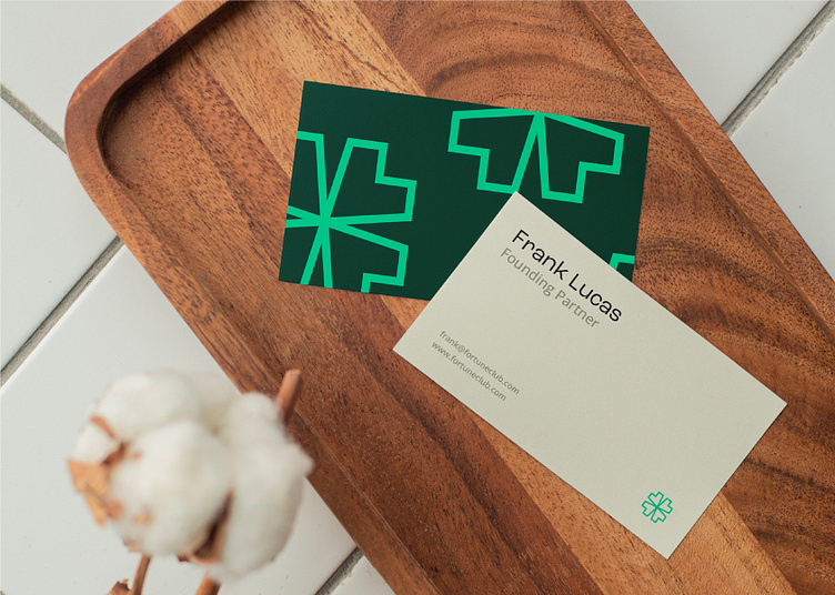
After experimenting with the execution of the icon and finding the strongest option, I began to work on pairing the icon with some typography which matched the bold and brave ambitions of the brand whilst not coming across too professional/corporate. Once I had settled on Roc Grotesk after a few minor customisations, I set my focus to the colour palette. I did a lot of colour analysis when researching the industry and competitor landscape and saw an opportunity to utilise deeper and richer green hues which married up perfectly with the health-focused supplementation industry.
Fancy creating or refreshing your brand's identity?
