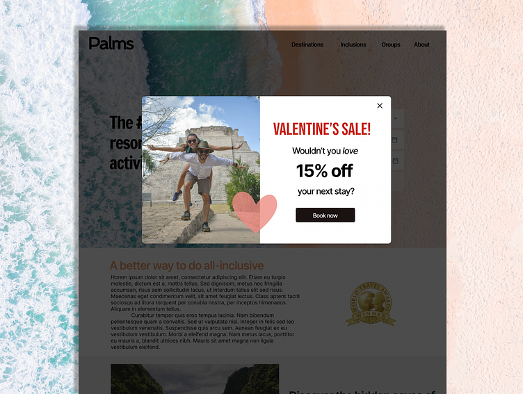
#DailyUI Day 16: Pop-up/Overlay.
Since it's Valentine's Day, I wanted to do something festive. So, I decided on my pop-up would be a sale ad for a resort website. I chose use a darker overlay over the site below the pop-up to increase contrast between the ad and everything behind it to improve clarity of the popup.
More by Alyssa Hennessey View profile
Like
