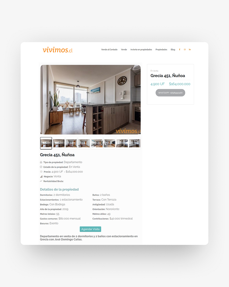
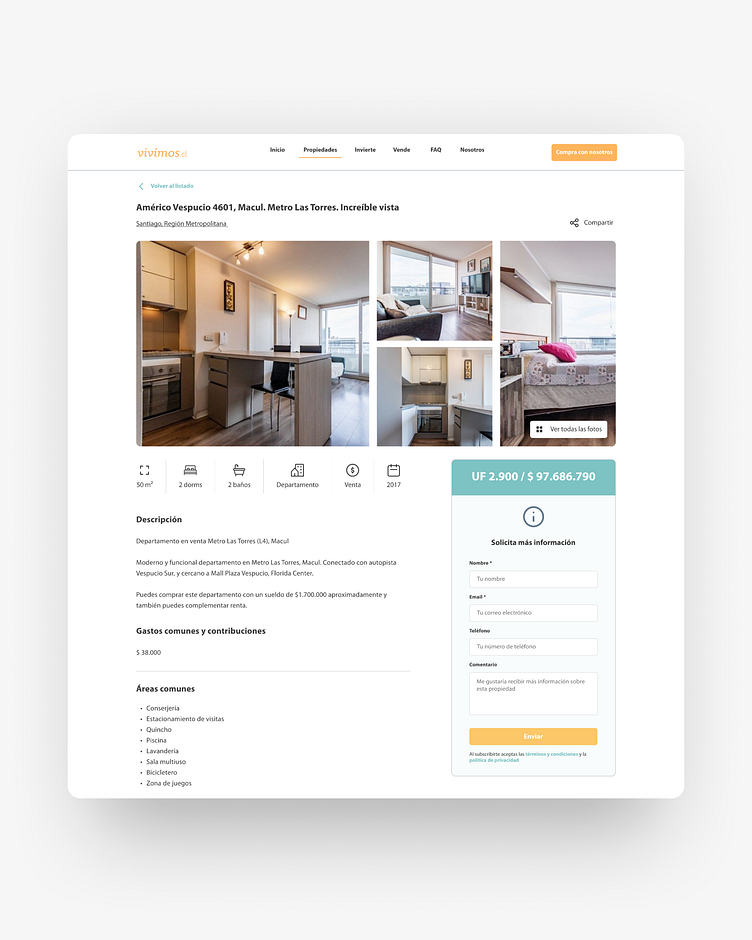
Real Estate Landing Page

Check out my before and after website redesign for a real estate company based in Chile.
My main goal was to update the outmoded UI part of their old website to look modern and clean while maintaining their brand identity. When I checked through the previous website of Vivimos, I realized that there was no guideline system for typography such as headings, subheadings, and paragraphs. I chose font styles that are relevant to the brand identity and reflect the brand personality with readability.
In addition, each component on the website wasn’t harmonized and didn’t really show the identity of the brand.
So I came up with 3 main solutions:
1. Use consistent colors and themes.
2. Use clearly readable typography.
3. Use UI elements and good images reflecting brand identity.
What do you guys think of the redesign? Swipe to see the before and after results 😄