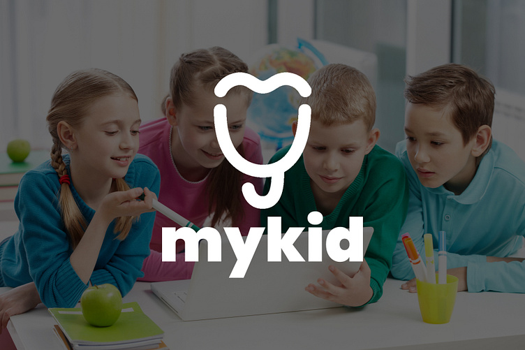
Mykid brand identify


Mykid
About the project
[EN]
A Kazakh service that selects best children's organizations. It presents kindergardens, educational centers, sports clubs and much more.
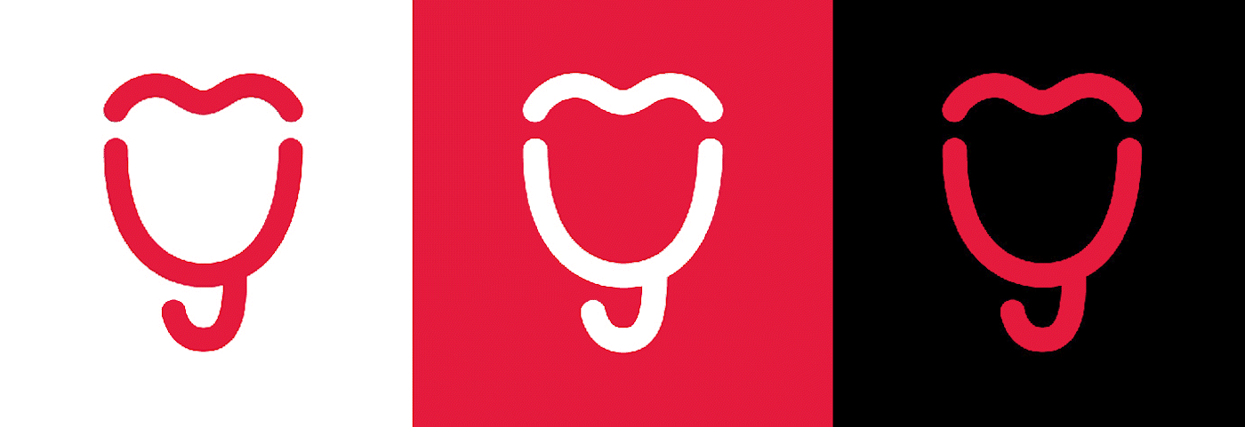
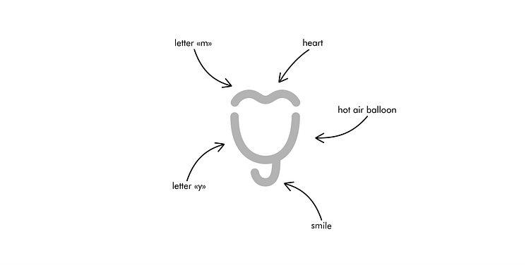
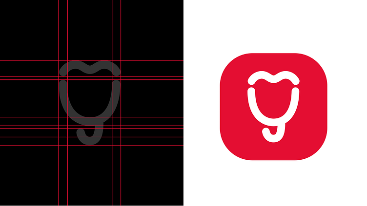
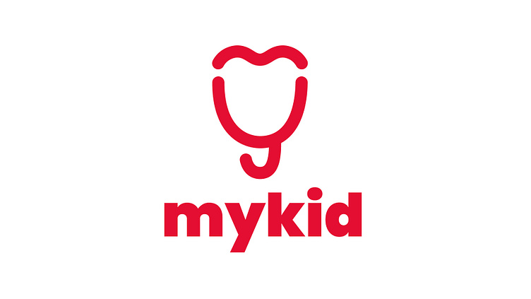
Task - to create a logo that will include a hot air balloon and be associated with childhood.
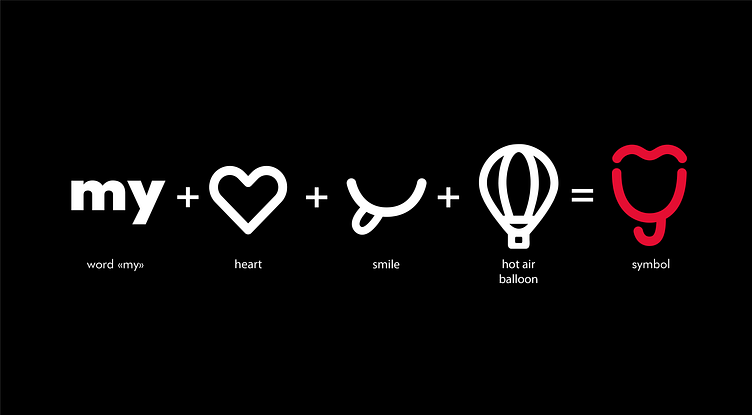
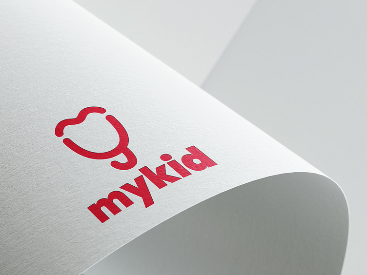
Solution - the logo is made up of lines with rounded edges. It includes a balloon, a smile, a heart and the first letters of the name - "my". The logo is simple and minimalistic, which is immediately memorable.
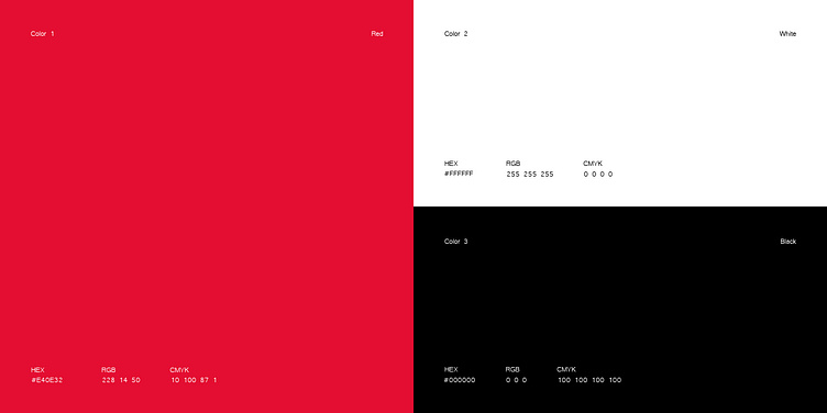
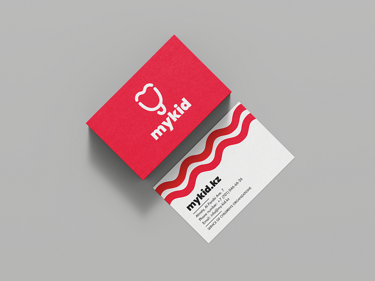
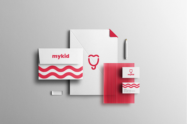
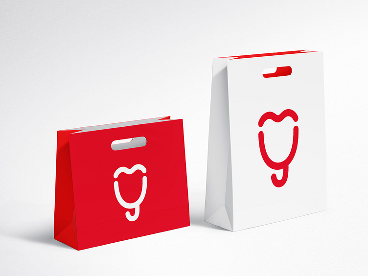
Colors - red was chosen as the main color, as it was one of the wishes of the customer. The red color symbolizes joy, life and love for children.
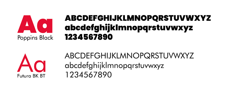
Font - the font Poppins was chosen because it is associated with childhood and fits well.
[RU]
Это казахский сервис для подбора детских организаций. Включающий в себя детские сады, образовательные центры, спортивные секции и многое другое.
Задача - создать логотип, который будет включать в себя воздушный шар и ассоциироваться с детством.
Решение - логотип создан из линий с закругленными краями. Он включает в себя воздушный шар, улыбку, сердце и первые буквы названия - "my". Логотип простой и минималистичный, который сразу запоминается.
Цвета - основным цветом был выбран красный, так как это было одним из пожеланий заказчика. Красный цвет символизирует радость, жизнь и любовь к детям.
Шрифт - был выбран шрифт Poppins, потому что ассоциируется с детством и хорошо подходит.