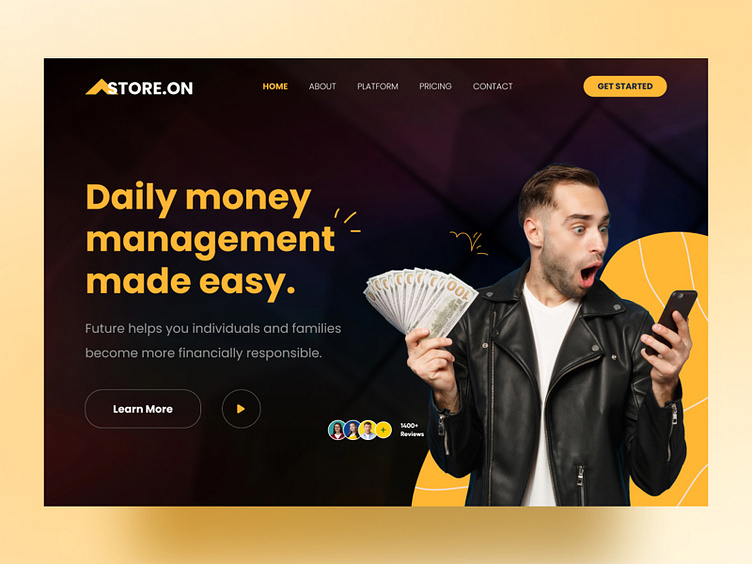
Money Management Header Design
Money management header design is a visual representation of the content or theme of a financial website or application. The header design can impact the overall user experience and first impression of the website or application. A good money management header design should be visually appealing, clear, and concise, effectively communicating the purpose of the website or application.
Here are some key elements to consider when designing a money management header:
Logo: The logo should be prominently displayed in the header, serving as the visual identity of the brand.
Navigation menu: The header should include a navigation menu that allows users to easily access different sections of the website or application.
Search bar: Including a search bar in the header can make it easier for users to find what they're looking for.
Call-to-Action (CTA): A prominent CTA can encourage users to take a desired action, such as signing up or logging in.
Color scheme: The color scheme should be consistent with the overall brand and website design. Bold colors can draw attention to important elements, while neutral colors can create a calm and professional atmosphere.
Typography: Clear and legible typography is important in ensuring that the header design is easy to read and understand.
Overall, the design of a money management header should effectively convey the brand's values and goals while providing a clear and intuitive user experience.
Full View
👀 Don't forget to follow us.
We're available for new projects!
Drop us a line at 💌 hexalabdigital@gmail.com
🤝 Thanks for your time and have a good day!


