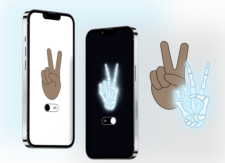
#DailyUX Day 15: On/Off Switch.
I find the prompts for usually minor components the most challenging. It can be hard to conceptualize something like an on/off button without a direction to go for the screen/app that it would be part of. So, instead of designing an entire more complex screen that the on-off screen would be part of, I thought through different visual oppositional on-off concepts. I landed on this, a hand and x-ray of the hand.
More by Alyssa Hennessey View profile
Like
