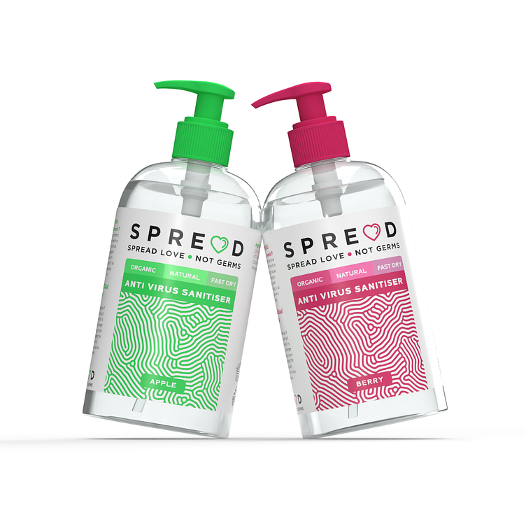
SPREAD LOVE - NOT GERMS Hand Sanitiser
DESIGN BY: Tony Musso
CATEGORY: Cosmetics | Health & Beauty
WEBSITE: www.ynottony.co.uk
PORTFOLIO: www.ynottony.co.uk/portfolio
The Brief
As a packaging and brand designer, I was tasked with creating a label design for a new brand called "SPREAD". The brand's slogan was "Spread Love, Not Germs", and its primary product was hand sanitiser, which was particularly relevant during the COVID-19 pandemic.
The challenge was to create a label design that would reflect the brand's values of positivity and care while also conveying the efficacy of the product. I began by researching the market to understand the trends and competitors, as well as looking at the different hand sanitiser formulations available.
The Research
After conducting research, I determined that I wanted the design to have a clean, modern, and playful aesthetic to differentiate it from other hand sanitiser products that tended to have a more clinical feel. Additionally, I knew that I wanted to create a design that was inviting and approachable, one that would convey a sense of safety and protection.
The Design Process
I started the design process by choosing a bright, vibrant colour palette of green, pink and peach which would be visually appealing and help the product stand out on the shelves for their given scents. I chose a sans-serif typeface for the brand name, which was simple and easy to read. I then created a playful and unique logo by using the letters in the brand name to form an abstract representation of love. The message of the logo was simple: spread love, not germs. This became the foundation of the label design.
Next, I focused on the typography for the product information, such as the name and size of the product, the list of active ingredients, and the usage instructions. I used a clean and legible font that was easily readable and helped convey the safety and efficacy of the product.
To give the design a personal touch, I included the SPREAD brand slogan, "Spread Love, Not Germs," prominently on the front. This conveyed the brand's core values and message, while also encouraging a positive mindset in the midst of the pandemic.
Throughout the design process, I focused on creating a design that would be welcoming, playful, and approachable, while still communicating the efficacy of the product. The final design was a vibrant and colourful label that conveyed the brand's values and message, while also standing out on the shelves.
The Conclusion
Overall, I am extremely proud of the final design for the SPREAD label. It was an honour to work on a project that was designed to help keep people safe during a global pandemic. The label design conveyed the brand's message of love and positivity, while also helping to protect people from the spread of illness. I believe that the label design will help to establish SPREAD as a trusted brand that consumers can turn to in these uncertain times.


