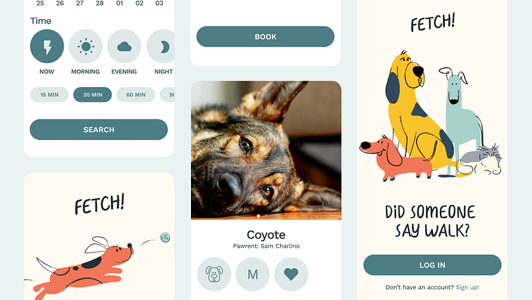
Fetch App Case Study— The fastest way to schedule a walk.
Problem Statement
Fetch is a mobile application offering dog-walking services on demand with local pet, care givers in the area.
The Problem that Fetch! had to solve for was fairly straight forward; to offer an alternative Dog Walking app then what is currently on the market; a more prompt and immediate walk schedule to ensure that pets have the care they need, even during last minute binds.
To begin, I started to identify pain points that current dog owners have with their current solution for dog walking services and frustrations with current apps:
An Empathetic User Persona
After looking at ratings on other apps, interviewing friends and family, and conducting polls, I came up with a User Persona to be the our northstar for this application.
User Flows
For this MVP, my goal was to create a simple and speedy onboarding flow that led right into adding the pet-owners details on their best friend.
Visual Design
From here, it was time to focus on visual design and the style of the application. We weren’t given a visual brand, so it was up to the designer to develop one for an MVP launch. After doing market research on current competitors, I found that most existing apps used a flat darker green and so I wanted to make sure the visual brand of this application was different and stood out. I decided to focus on a lighter, friendlier approach with pastel colors for accessibility and hand drawn illustrations to add to that.
From here I created a number of components, some with variations that contain interactions.
Through the visual design stage, I learned about workflow and how to ensure a strategic user centric flow. Working through this process, I began to build out components that could be used throughout the MVP to create brand consistency and ensuring a smooth flow and addressing the pain points addressed above.
Prototype
Coming soon!


