VINTAGE ECOMMERCE STORE
VINTAGE ECOMMERCE STORE
An eCommerce clothing store that lists products, events, and contact information in a contemporary way that also captures user attention. This design highlights products with featured elements and also informs the user of product recommendations. More specifics about this design are down below ↓
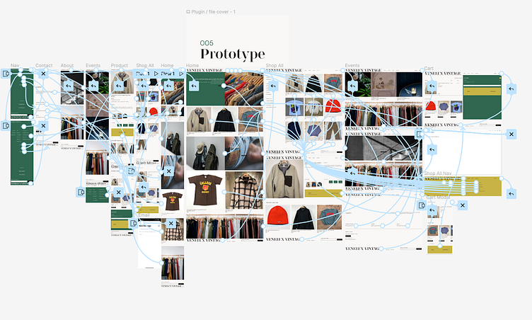
Figma links:
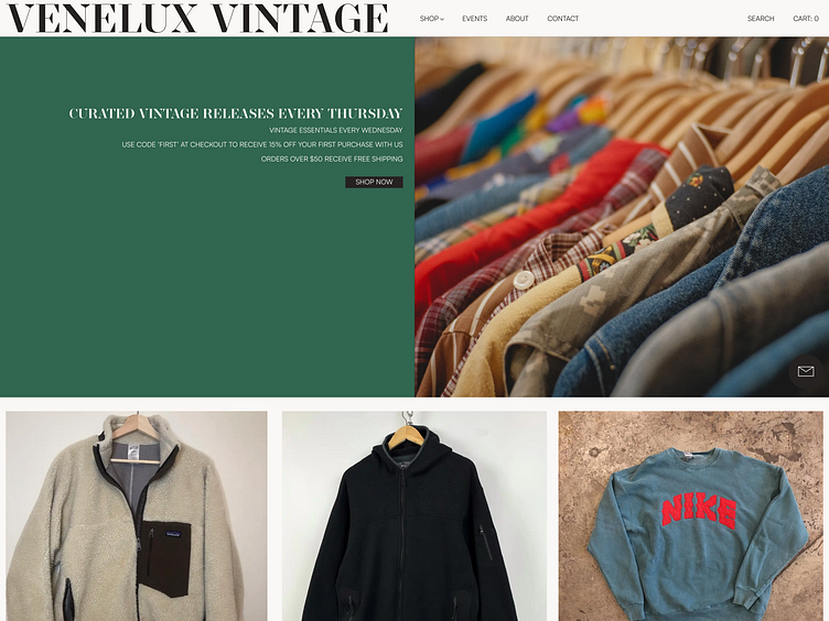
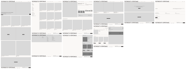
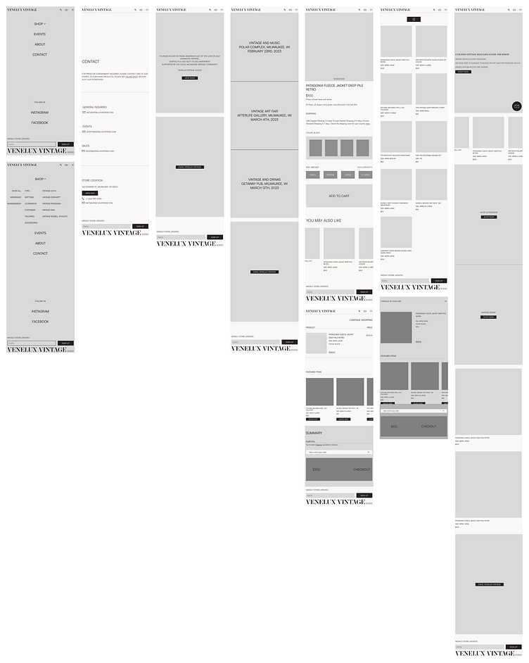
LANDING
Utilizing the rule of thirds, the shop now button is placed specifically in the first top-left intersection to grab user attention instantly. Crucial product information is also displayed directly above the button to aid in user conversion. Recommended products are listed in a horizontal carousel directly below and in sight of the initial view port. The mail icon is a sticky component that will follow the user as they scroll down to the bottom of the page.
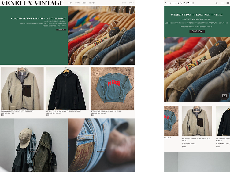
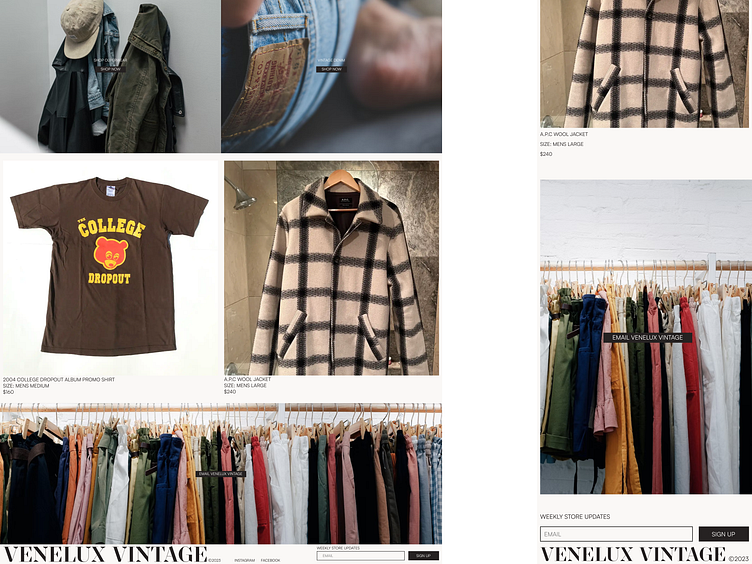
Remaining on the homepage are category-specific links that aim to highlight a subset of products that may be specifically in demand. Also, a set of featured products is displayed below, along with an email link.
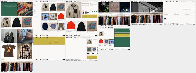
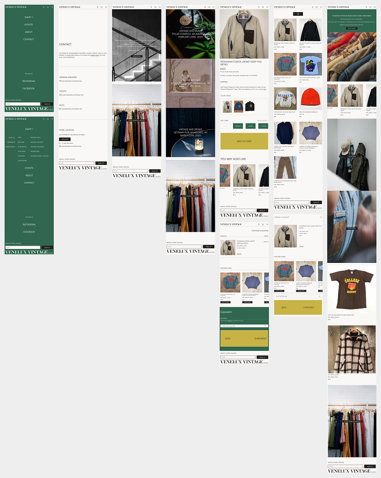
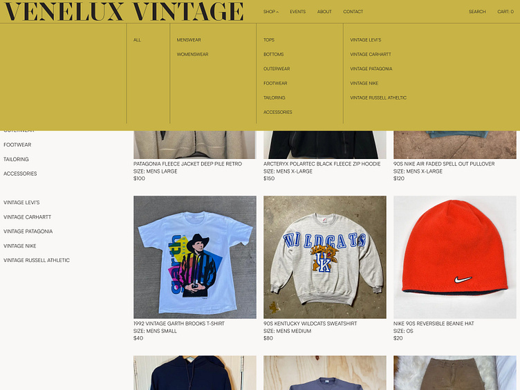
PRODUCT LIST
Listed in three columns, we have multiple rows of products that allow room for category filters.
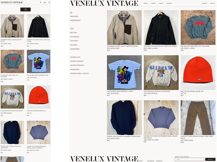
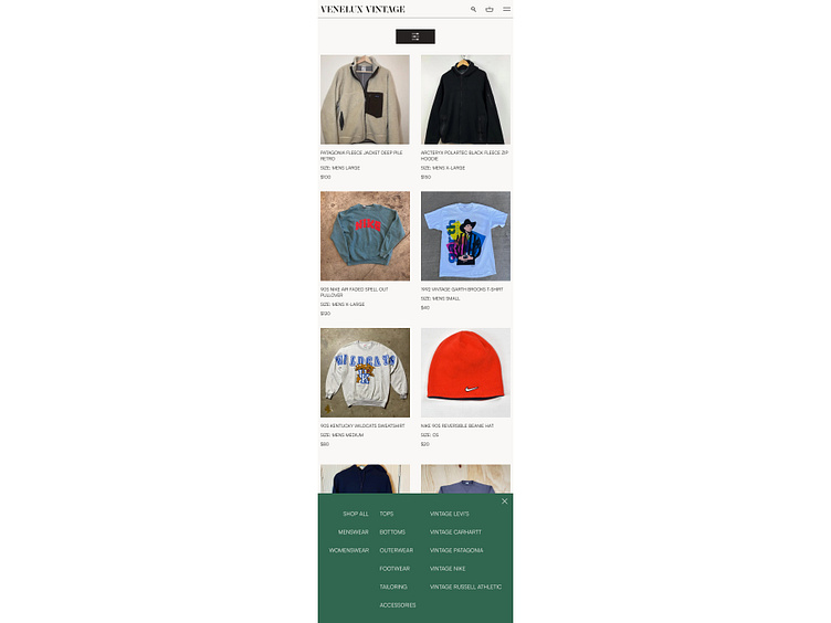
The shop anchor within the header contains a dropdown of product categories for quick, specific navigation.
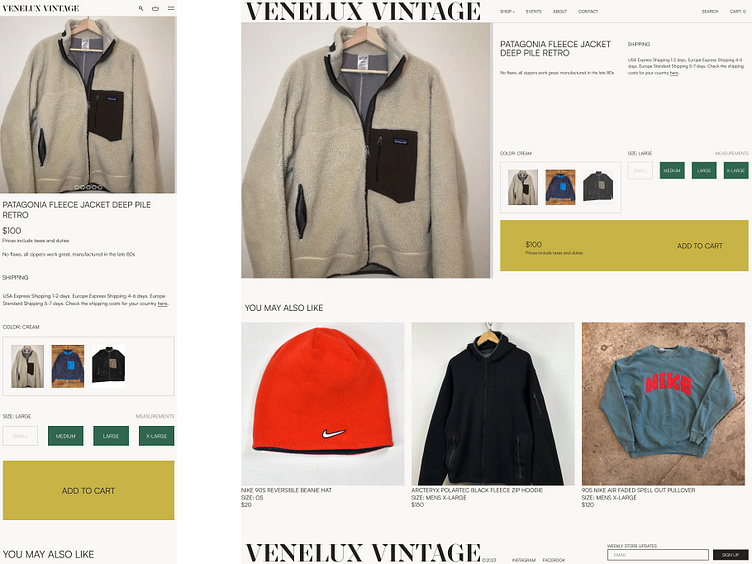
PRODUCT PAGE
With multiple product variations in mind, users have the option to select multiple colors and sizes. The product image will vertically transition to next slide on desktop while mobile has a horizontal scroll option. Listed below in another horizontal carousel is a list of recommended products.
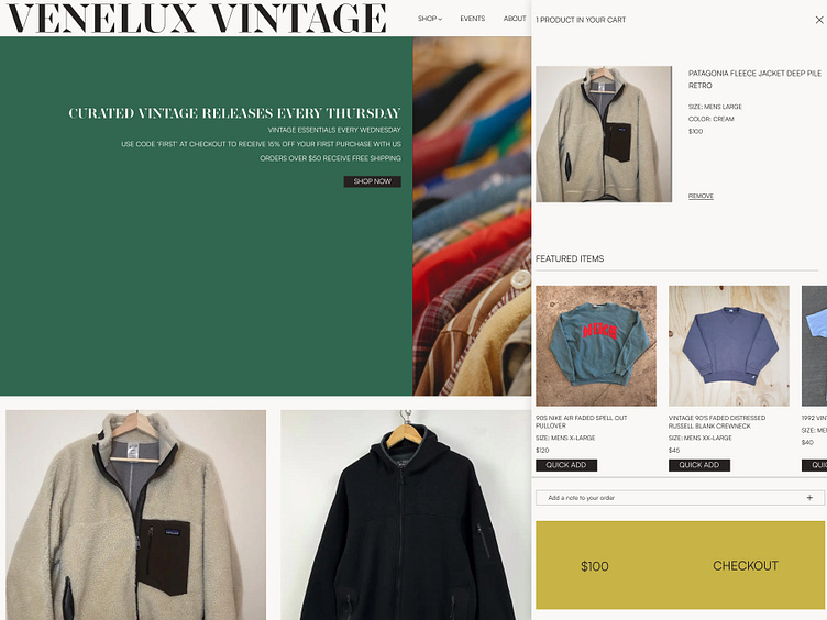
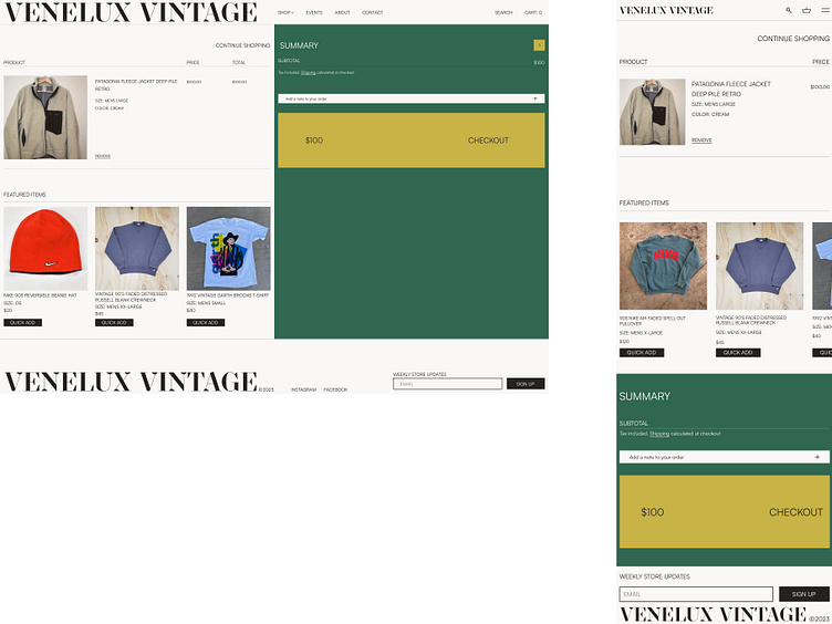
SHOPPING CART
Within a pop up modal window the user can view their shopping cart on any page. Below the added products is a horizontal list of featured items that can be quick added for user convenience.
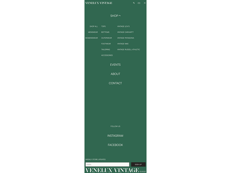
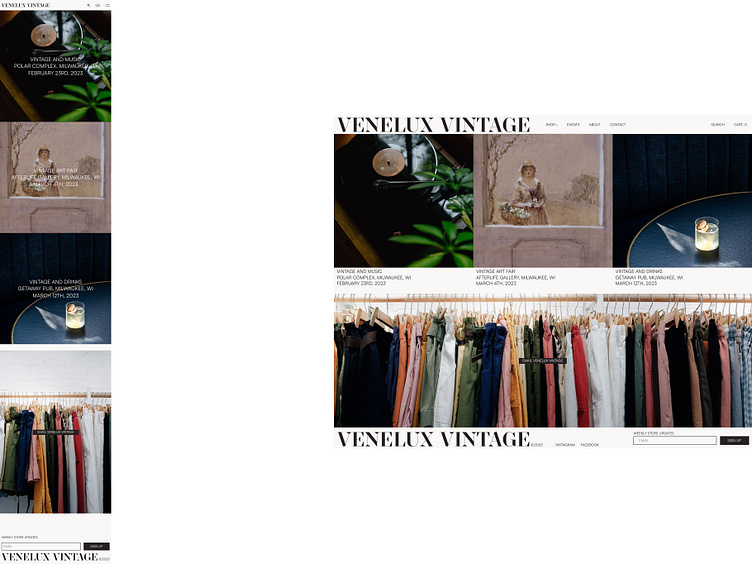
EVENTS
Having brand events in mind, a user can view a list of upcoming get togethers on the Event page.
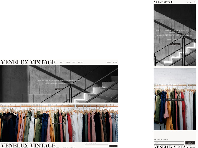
ABOUT
The typical essential about page is simple in this design with a call to action that brings a user to the shop all page.
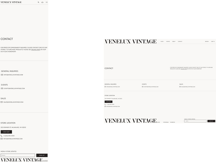
CONTACT
On the contact page, a user can find brand specific emails with store specific contact information.
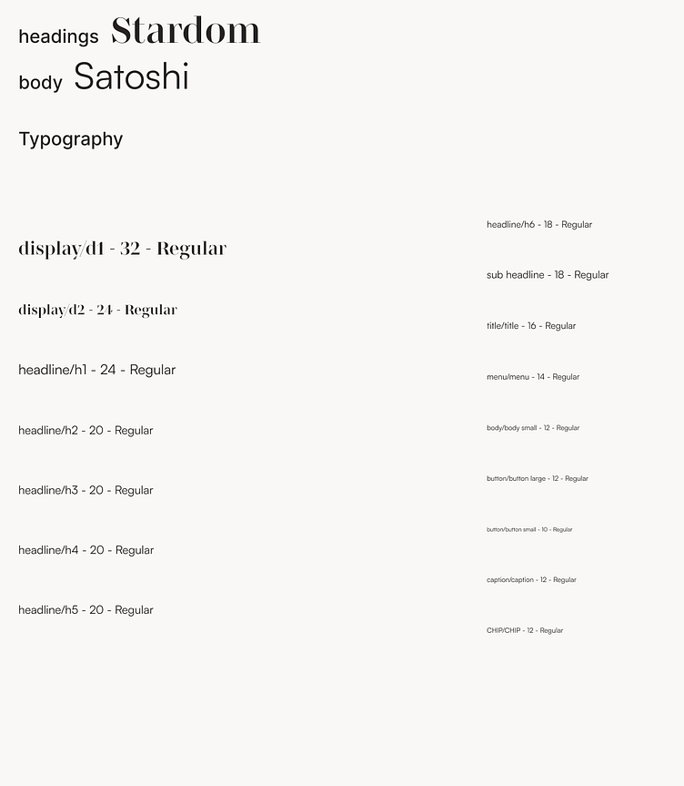
STYLE GUIDE
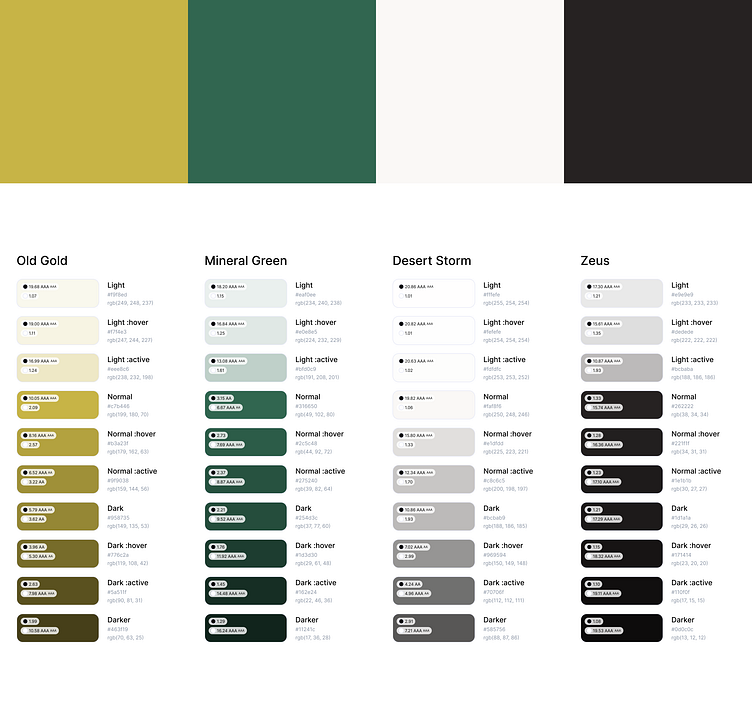
Mineral Green, being the highlight color of the palette, is complimented with an Old Gold accent. The Stardom font is accompanied by Satoshi for easy readability. Desktop views were built with a full page width 12-column grid, while mobile views utilize a page width 4-column grid.
STYLE GUIDE
Mineral Green being the highlight color of the palette is complimented with an Old Gold accent. The Stardom font is accompanied by Satoshi for easy readability. Desktop views were built with a full page width 12-column grid, while mobile views utilize a page width 4-column grid.
MOCKUPS
After the wireframing process, I was able to easily translate them into mockups with real content.