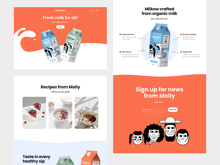
Milkow - Website design for the milk brand
A brand's visual consistency is key to success
A few months ago we shared the Milkow branding and packaging project you liked so much because of the style, illustrations, and story of the brand.
Today we want to share a promo website that follows the brand's visual identity.
Our approach
The layout of the website is built on bright and bold color combinations for backgrounds that effectively highlight different products in different colors of packaging. And also it combined together with clean and attractive photos. The website also shows the main advantages of the products.
In order to maintain the external consistency and recognizable patterns of the commercial site for the users, we used a stylish and minimalistic header on the website with the most recognizable brand element in the center.
Thus, as a result of the project, the Milkow brand received a reliable and effective sales channel through the landing page, which consistently reflects the brand identity and makes the customer experience holistic, interesting and seamless.


