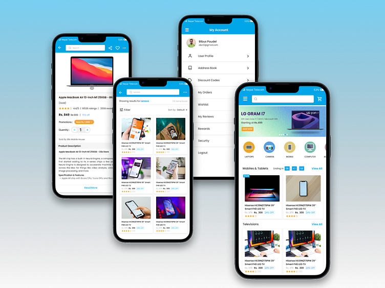
Streamlining the Checkout Experience of SY Bazzar Mobile App
As an avid online shopper, I've experienced my fair share of frustrating checkout processes. I wanted to tackle this problem and create a mobile app design that streamlines the checkout experience for users.
The brief for this mobile app design was to create a simple, user-friendly checkout process for an online retailer. I wanted to eliminate the clutter and confusion often found in traditional checkout flows and provide a seamless, stress-free experience for users.
I started by researching best practices for checkout flows and conducting user testing to understand common pain points. From there, I created wireframes and prototypes to test various design solutions. After multiple rounds of testing and refinement, I arrived at the final design as above.
The final design features a clean, intuitive interface with clear calls to action and minimal form fields. The design eliminates the need for users to navigate between multiple screens, making the checkout process quick and effortless. To further streamline the experience, I also included the option to save payment information for future purchases.
I used Figma and Photoshop to design and prototype this mobile app, incorporating responsive design principles to ensure a seamless experience on a variety of devices. I also utilized user testing to validate the design and make necessary improvements.
I'm eager to hear your thoughts on this mobile app design! Do you think the checkout process is simple and intuitive? Are there any areas for improvement? Let me know your thoughts.
