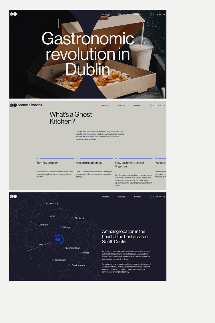
Space Kitckens (Branding & Web design)
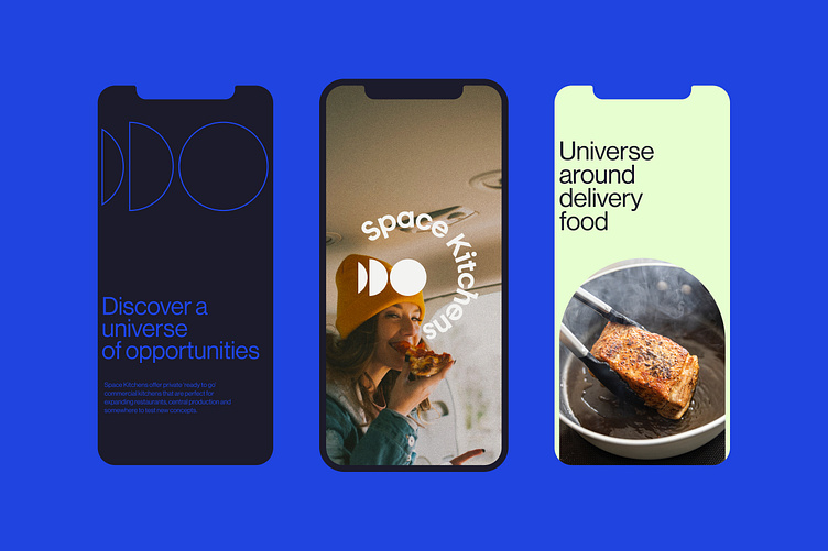
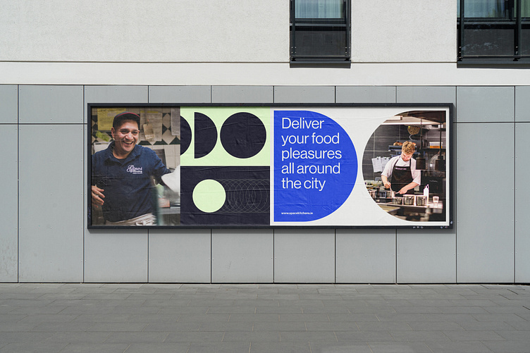
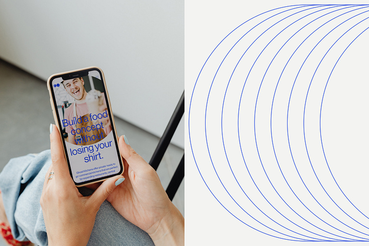
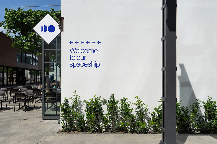
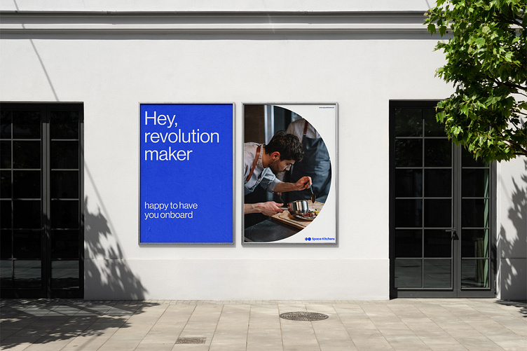
The brand system is a collection of bold and kinetic shapes, each with multiple variations with the same idea of expansion and movement. A blue based colour palette was created to mimic the uniververse imaginary, but keeping a corporate and sober tone, holding a B2B company character.
The identity is brought to life creating a flexible, modular, always-moving brand system. The graphic language exaggerates the clean geometry of the icon by using it at a super-scale size, often at different proportions, to create vibrant blocks of colour and allow for visual dynamism.