Sparkasse - Home & Transaction Details | Bank App
Hey all 👋,
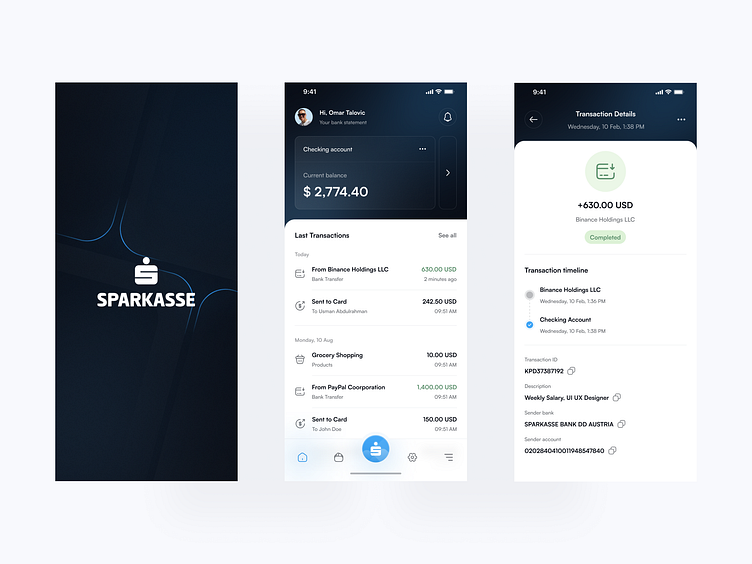
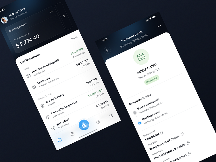
Today, I'd like to showcase one of my recent projects: a redesign of a banking application. As a long-time user of Sparkasse Bank services, I've struggled with navigating the app and finding the information I need. Additionally, the visual design was not particularly appealing. This inspired me to create a new and improved version.
As a starting point, I conducted thorough research on Sparkasse Bank's current mobile application, looking into the areas where users face the most challenges and frustrations. This included studying the existing User Interface (UI) and User Experience (UX) design, as well as reading feedback from current users.
In terms of UI design, I focused on creating a visually appealing and modern design that is easy to use. This included the use of high-quality graphics, clear typography, and a color palette that is both attractive and accessible.
Overall, my redesign of the Sparkasse Bank mobile application aimed to create a user-centered design that prioritizes the needs of the users and provides a seamless, intuitive experience.

Thanks For Scrolling😉
Hope you guys like it and thank you for it checking out.
Please share your opinion in the comments section and don’t forget to press “L” to show some love.
