7 Sounds - Logo Design
7 Sounds
7 Sounds is a music production company, helping variety of artists from different backgrounds.
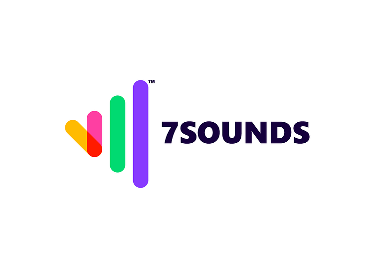
The logo direction is the combination of the name as well as the purpose of the company. It consists of number 7 in roman numerals (VII) structured in a way that implies sound frequency.
The logo is a stylized representation of the brand name and features a vibrant color palette. The colours of the logo are chosen to symbolize trust, stability, and professionalism. Accented with pops of bright red, which represents energy and excitement, and a warm yellow, which represents happiness and positivity. The color scheme creates a dynamic and eye-catching design that embodies the brand's values and mission.
The typography is modern and sleek, with clean lines and a sans-serif font. Overall, the logo effectively captures the brand's spirit and message, making it instantly recognizable and memorable to consumers.
Interested in a logo? Get in touch:
🏀 Dribbble: Newtreenoh
📸 Instagram: Newtreenoh

